|
|
Post by Cory on Aug 12, 2016 16:10:30 GMT -5
I wanted to start this thread to talk about framing GPK items, mostly artwork. I didn't want Tommy's collection thread to get hijacked into a framing opinions thread.  You can talk about anything here. What materials to use, colors, should borders be shown, frame mock ups, etc. As I stated in the other thread, I the minimum amount of distraction in a frame. I believe the art should speak for itself. I used to frame with cards and wrappers and one day just decided to simplify the whole thing. Also, things need to be uniform. Same size frames or openings. Typically you can't have both. 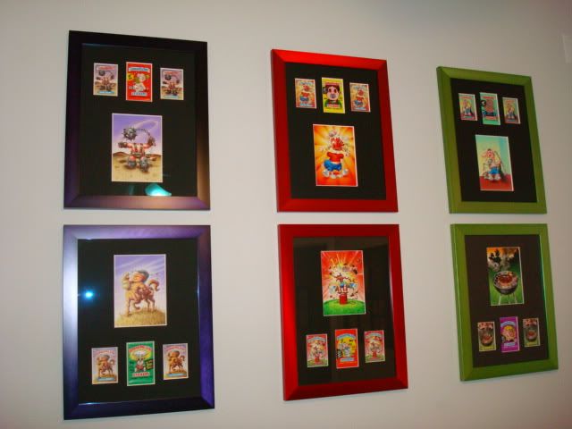 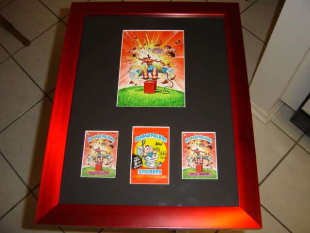 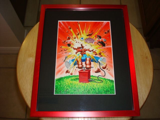 Do you think the decision to move to a simplified frame made it better? Also, I think roughs look better without all of the border stuff in. 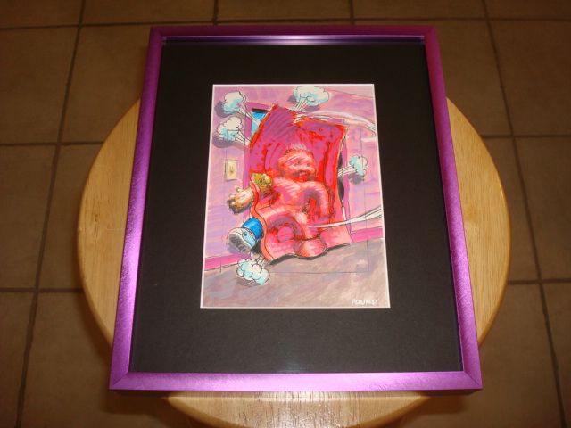 What do you think? |
|
|
|
Post by tommy4ya on Aug 12, 2016 16:41:48 GMT -5
I think if you get Pound to add some notes to the pack and cards they can stay otherwise get them out  As much as I think I'll like having the actual cards framed I've never liked it, looks too busy. I've tried just about everywhere too. Flanked, top, bottom and it just kind of takes away from the art no matter what I do. Also you cheated that color rough doesn't have a final  |
|
|
|
Post by fowlraoul on Aug 12, 2016 16:43:45 GMT -5
nice!! wow, i had no idea you had your pieces framed that way before, cory.
i think they look great, but i am not big on framing with wrappers and cards...i do like the multi art process frameups very much
after framing and reframing...the conclusions i have come to is that uniform size is super important(learned that the hard way) and im big on the non reflective glass.
looking forward to what people say on the thread!
|
|
|
|
Post by Jimbo on Aug 12, 2016 16:59:56 GMT -5
In my opinion the art should speak for itself. Only the art should be in the frame. The standard for a 5x7 final should be a 10x12 frame. The frame color should be a close match to either a major or minor color used in the final. The outer mat color should compliment the major colors in the piece and draw the eyes inward towards the final. It should be 2 3/8" above and below the art and 2 1/2" on either side of the art. The inner mat should be 1/8" to 1/4" and also compliment one of the minor colors used in the final. If at all possible the inner mat should not touch the color it matches. It is best if the inner mat color matches a color used in the interior of the final. FYI, I am kind of a big deal so you should all listen to me when deciding how to frame your art |
|
|
|
Post by Cory on Aug 12, 2016 17:44:55 GMT -5
I think if you get Pound to add some notes to the pack and cards they can stay otherwise get them out As much as I think I'll like having the actual cards framed I've never liked it, looks too busy. I've tried just about everywhere too. Flanked, top, bottom and it just kind of takes away from the art no matter what I do. Also you cheated that color rough doesn't have a final The reason I own the color rough for Keith Out is because there isn't a final to be had.  I'd love for someone to discover the run of OS16 kids. |
|
|
|
Post by pinkladyslippers on Aug 12, 2016 17:45:16 GMT -5
Cory, I like the simplified versions of your framing better, so we'll done on that decision. Great collection!
|
|
|
|
Post by Mark Pingitore on Aug 12, 2016 17:46:26 GMT -5
I personally follow pretty much what Jimbo said, except I use black frames. I usually pick an accent color for the inner mat that complements the background color. For the outer mat, I usually pick a color halfway between the gradient of the background or some variation of it, or another prominent color in the painting. I also try not to have the inner mat color touch/match the same color in the painting to avoid have too much of the same color. For color roughs, I prefer them cropped to the borders of the art and don't like cards/COAs/etc framed with art. Everyone has their own preferences though! I like to use this website to get an idea of what I'm aiming for. fslj.larsonjuhl.com/?ANo=nnnnnYou can upload an image and test out mats and even save and print the mockups to bring with you to the framers. |
|
|
|
Post by Cory on Aug 12, 2016 17:51:51 GMT -5
I personally follow pretty much what Jimbo said, except I use black frames. I usually pick an accent color for the inner mat that complements the background color. For the outer mat, I usually pick a color halfway between the gradient of the background or some variation of it, or another prominent color in the painting. I also try not to have the inner mat color touch/match the same color in the painting to avoid have too much of the same color. For color roughs, I prefer them cropped to the borders of the art and don't like cards/COAs/etc framed with art. Everyone has their own preferences though! I'm so minimalist that I don't even like colored mats - I tried that before too and didn't dig it. I don't like double mats either. We have a similar approach except you make all of your frames the same color, while I make all of my mats the same color. I don't think I've ever seen a framed COA. That really needs to be left out. |
|
|
|
Post by ADAM Bomb on Aug 12, 2016 21:37:42 GMT -5
Would everyone mind posting up an example of their frames so we can see them all in this one thread. I just got some of my art in frames 2 weeks ago! Double mat, floating, museum glass. 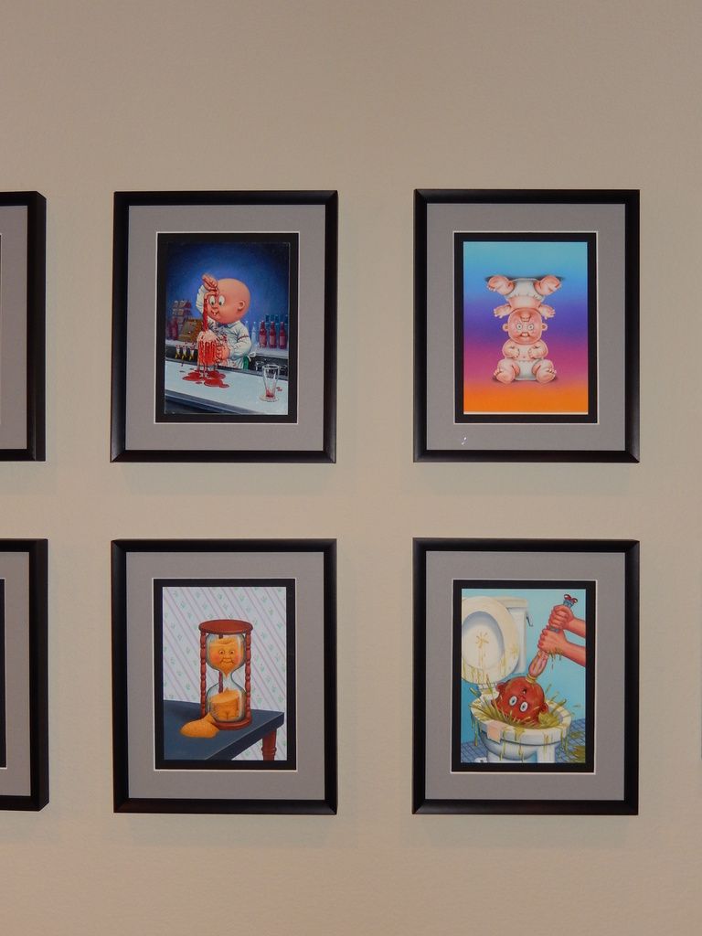 And my 10th series pencil,color,final. 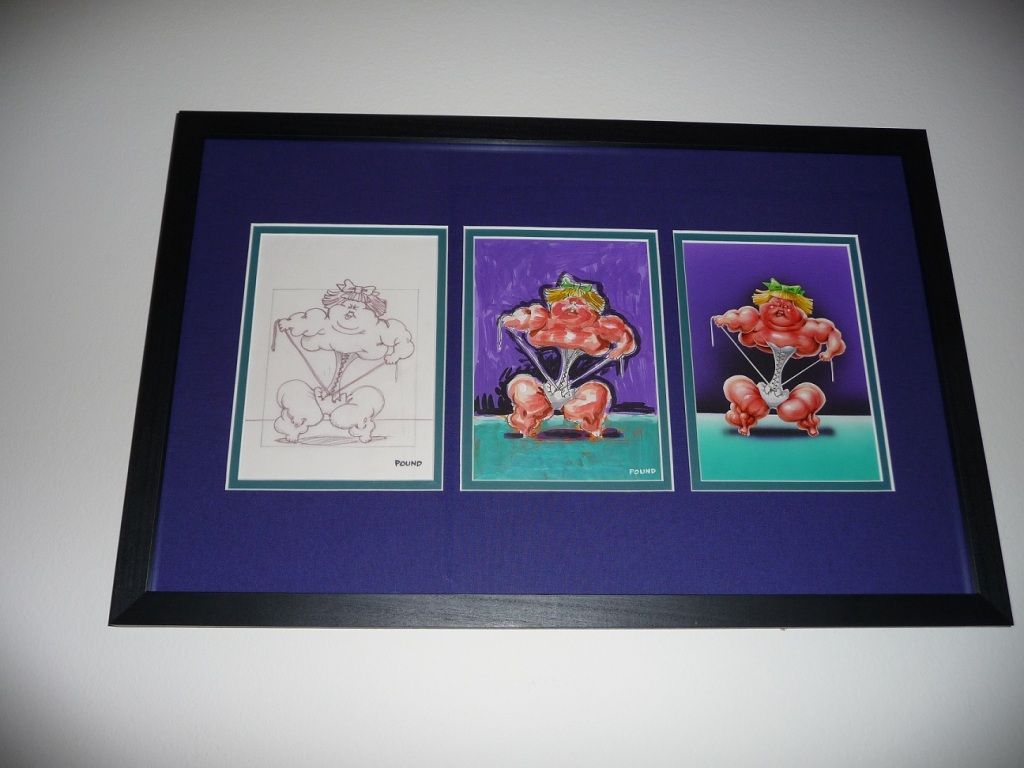 |
|
|
|
Post by Jimbo on Aug 12, 2016 22:02:42 GMT -5
Here are a couple examples of my finals. Most follow the format I described above but I did let my framer get creative with a couple (ie. Cracked Crystal and Trish Squish). 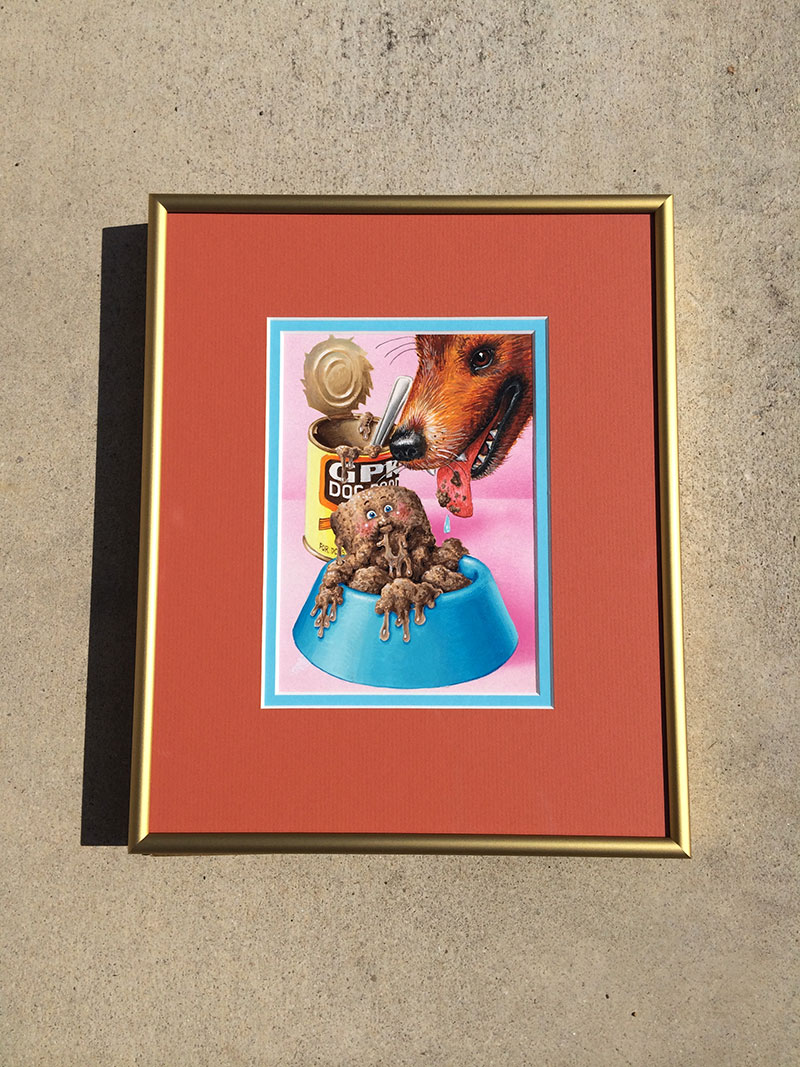 So for the frame I used gold which matches the color of the inside lid of the can. The large outer mat color matches the dog and the inner mat color matches the dog bowl. Notice how it does not actually touch the dog bowl though. Very important. 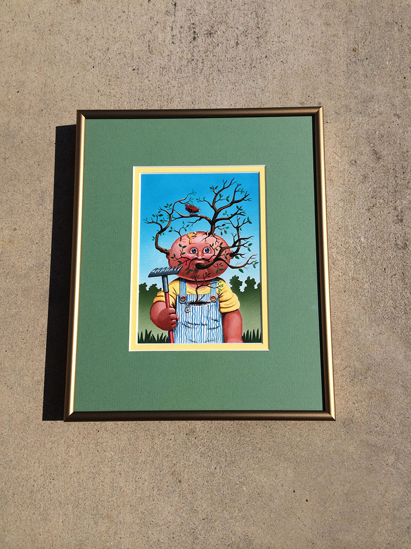 Again with the gold frame here. Plays off his buttons and works nicely with the yellow and brown. Obviously the green outer mat draws the eyes in and works well with Lee's background. The yellow inner mat works with Lee's shirt but does not touch! 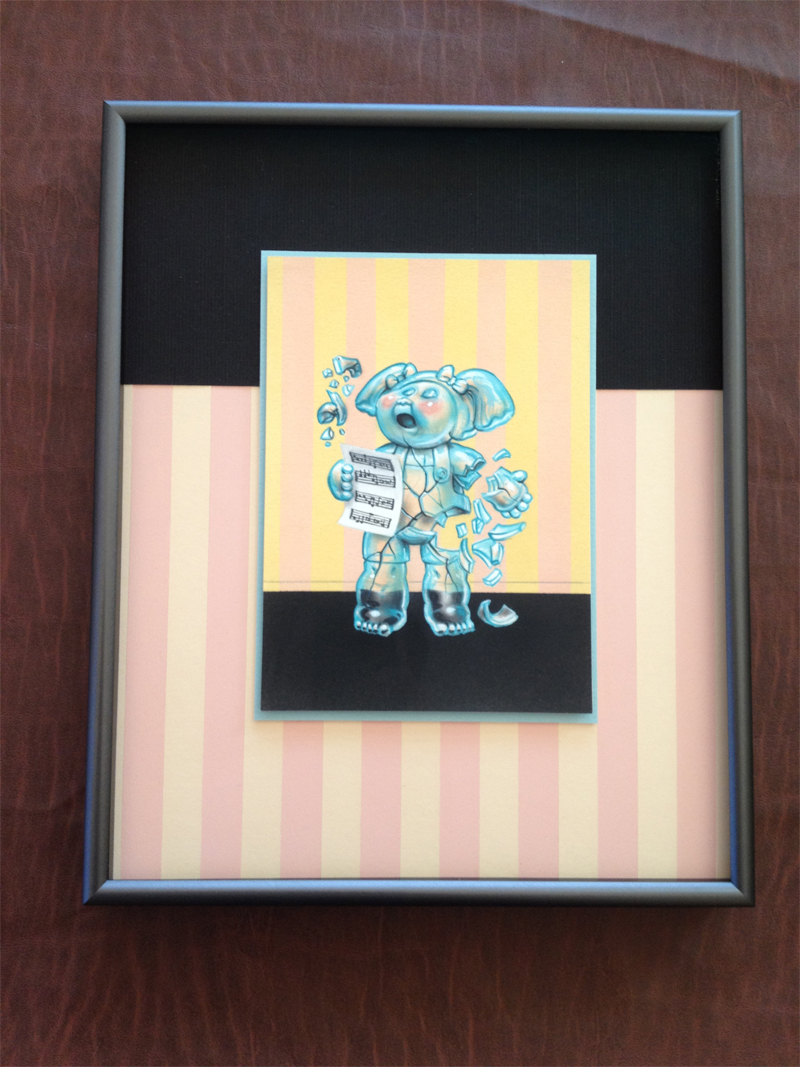 The framer had some artistic license on the matting. Basically reversed the stage/background for the outer mat. Crystal is actually floating here and the inner mat matches her translucent blue. 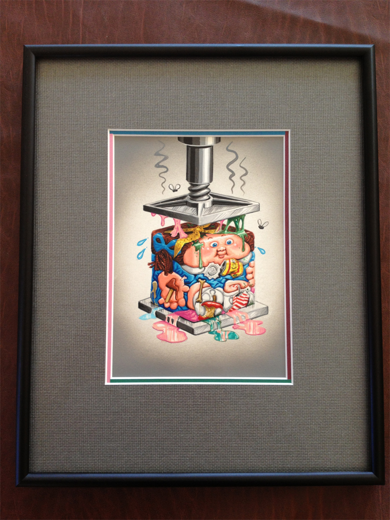 Trish is framed like all my others size wise. The metallic black frame works with the steel press. The outer mat works well with Trish's grey background. Again the framer had some artistic license here and used 4 different inner mat colors. All 4 colors are represented in Trish's compressed cube but again, the inner mat never touches any of those colors. |
|
|
|
Post by fowlraoul on Aug 12, 2016 22:44:21 GMT -5
Ah man I LOVE those thin color frames... Absolutely perfect frameups in my book, Jimbo.
Man I wish I had all this advice a couple years ago before I started framing lol
|
|
|
|
Post by Wayco on Aug 12, 2016 23:12:12 GMT -5
I like it simple too. These look really good! |
|
|
|
Post by Mike on Aug 13, 2016 1:03:50 GMT -5
Don't know what I'd do if I had a colour rough, I think it looks awesome the way Cory framed his, with all of Pounds notes covered. I also really do love seeing Pounds writing.
I know it's just writing but it is Pounds writing, it adds a lot to the story and gives more insight when the writing is visible. I guess in the end though I love that it looks more like art with the writing covered, looks more like a collectable with the notes exposed. I think for me if I only had one rough it would depend which it was as to how I would frame it.
I guess in most cases for me art would win out and I'd frame it cory-lie.
|
|
|
|
Post by Game8 on Aug 13, 2016 5:49:35 GMT -5
I haven't framed mutch yet but these are some i did. I do like how some framed only the painting from the color rough but i left the writing and pound notes visible. Imo thats what makes the color roughs special. I have some i'm going to do different but most will be framed like this. Black matte frame, outer mat a dark black, inner mat a color that matches the art work.  This is a painting dustin did for me. I kept the frame the same to match my other stuff.  Great thread btw cory. And i also think you're re-framed art looks better with out all that other stuff in it. |
|
|
|
Post by Wayco on Aug 13, 2016 8:02:15 GMT -5
I think it looks better in a matte without the handwriting from Pound BUT I prefer to see it with the handwriting. I like the notes, names, and GPK text.
I also prefer to have everything uniform. I will post an updated photo later of mine. Great thread for sure! Remember to always use Michaels and a 70% off coupon when they come up or their prices are way too expensive. The museum glass is a must, you can really see the details through it and it protects it from UVs.
|
|
|
|
Post by Cory on Aug 13, 2016 8:13:59 GMT -5
Would everyone mind posting up an example of their frames so we can see them all in this one thread. I just got some of my art in frames 2 weeks ago! Double mat, floating, museum glass. And my 10th series pencil,color,final. I like how you did the progression. Very uniform and it flows well. They are really close together, did you trim or fold the border paper to get them so close? I like your single frames too. Even more uniform than mine. I needed to have a touch of color. |
|
|
|
Post by Cory on Aug 13, 2016 8:17:34 GMT -5
Here are a couple examples of my finals. Most follow the format I described above but I did let my framer get creative with a couple (ie. Cracked Crystal and Trish Squish). So for the frame I used gold which matches the color of the inside lid of the can. The large outer mat color matches the dog and the inner mat color matches the dog bowl. Notice how it does not actually touch the dog bowl though. Very important. Again with the gold frame here. Plays off his buttons and works nicely with the yellow and brown. Obviously the green outer mat draws the eyes in and works well with Lee's background. The yellow inner mat works with Lee's shirt but does not touch! The framer had some artistic license on the matting. Basically reversed the stage/background for the outer mat. Crystal is actually floating here and the inner mat matches her translucent blue. Trish is framed like all my others size wise. The metallic black frame works with the steel press. The outer mat works well with Trish's grey background. Again the framer had some artistic license here and used 4 different inner mat colors. All 4 colors are represented in Trish's compressed cube but again, the inner mat never touches any of those colors. I love all of these frames. The artistic ones might overpower the art though. They are great and very fun to look at, but I find myself looking at the frame more than the art. |
|
|
|
Post by Mark Pingitore on Aug 13, 2016 8:27:41 GMT -5
|
|
|
|
Post by Jimbo on Aug 13, 2016 8:40:16 GMT -5
Absolutely beautiful frame jobs Mark! |
|
|
|
Post by Jimbo on Aug 13, 2016 8:46:30 GMT -5
I have a few color roughs. Two are actually at the frame shop right now. I am in the camp that you should not cover the writing on a color rough. It is a color rough, not a final. It will never be a final. Part of it being a "rough" is that is has thoughts/ideas/concepts/information written on it. I think that information is an important part of the piece. Here is my OS16 rough: 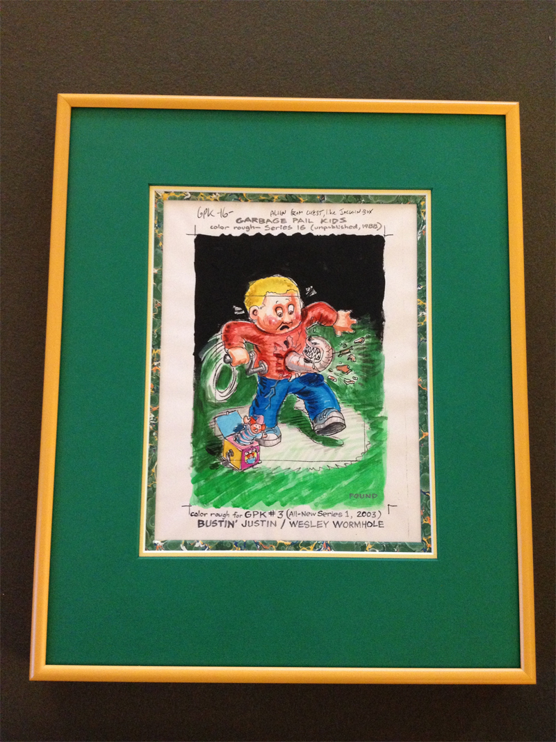 I also have Pizza Face Chase (thanks Mark!) and the Adam Bomb CR at the frame shop right now. I will post some pictures when I get them back. |
|
|
|
Post by Cory on Aug 13, 2016 10:23:08 GMT -5
I haven't framed mutch yet but these are some i did. I do like how some framed only the painting from the color rough but i left the writing and pound notes visible. Imo thats what makes the color roughs special. I have some i'm going to do different but most will be framed like this. Black matte frame, outer mat a dark black, inner mat a color that matches the art work. This is a painting dustin did for me. I kept the frame the same to match my other stuff. Great thread btw cory. And i also think you're re-framed art looks better with out all that other stuff in it. That's some crazy wallpaper  For the roughs I like the inside mat being similar to the background. I think that only works with the writing border showing. |
|
|
|
Post by rdominiack on Aug 13, 2016 12:11:53 GMT -5
I haven't framed mutch yet but these are some i did. I do like how some framed only the painting from the color rough but i left the writing and pound notes visible. Imo thats what makes the color roughs special. I have some i'm going to do different but most will be framed like this. Black matte frame, outer mat a dark black, inner mat a color that matches the art work. This is a painting dustin did for me. I kept the frame the same to match my other stuff. Great thread btw cory. And i also think you're re-framed art looks better with out all that other stuff in it. I really PREFER this look, I like the Black frames, like the simple mat choices and DEFINITELY like the words to be shown on the color roughs! So glad we are discussing this bc in the middle of big framing process and I felt kinda lost! This should help a bit... |
|
|
|
Post by tommy4ya on Aug 13, 2016 17:18:38 GMT -5
I don't think that the colorful metal frames I use on GPK work for very much else. They are popy and bright and 80s so metal color frames just kind of work for me. Here is a cleaned up version  |
|
|
|
Post by rdominiack on Aug 13, 2016 17:22:10 GMT -5
I don't think that the colorful metal frames I use on GPK work for very much else. They are popy and bright and 80s so metal color frames just kind of work for me. Here is a cleaned up version Very SHARP! Especially with that GOLD border....I like the Black frames more, but this works! |
|
|
|
Post by Jimbo on Aug 13, 2016 19:38:51 GMT -5
I don't think that the colorful metal frames I use on GPK work for very much else. They are popy and bright and 80s so metal color frames just kind of work for me. Here is a cleaned up version A perfect frame job. Excellent choices for all aspects. The frame, outer and inner mat. Love it. |
|
|
|
Post by Mark Pingitore on Aug 13, 2016 20:37:44 GMT -5
I keep the first post in my collection thread updated with my current collection btw. Would be great to see others do that too. |
|
|
|
Post by cMk on Aug 14, 2016 2:55:02 GMT -5
As long as you get The colors to play off the art I'm ok with colorful frames,textured mats. If you want a more refined look that's ok also.The art itself will tell you what needs to be done.Just have fun.I went a little wild with my Bunk piece because after all it's Tom Bunk.
|
|
|
|
Post by cMk on Aug 16, 2016 15:18:02 GMT -5
Would everyone mind posting up an example of their frames so we can see them all in this one thread. I just got some of my art in frames 2 weeks ago! Double mat, floating, museum glass. And my 10th series pencil,color,final. that 10th series frame up looks real nice. First time I've seen a multi frame up I like.I must also add I like the look of double mats With spacers.Gives the piece a more dimensional look. |
|
|
|
Post by caliagents1688 on Aug 19, 2016 12:14:25 GMT -5
Just beautiful fellas. Love the OS artwork. Original or bust, yeeeeeeeeee!
|
|
|
|
Post by Wayco on Aug 20, 2016 8:55:05 GMT -5
I have also tried many different things and ended up preferring the black mattes when so many are together. :)It was too busy with color mattes IMO. I also wish I went slightly bigger like Geoff I believe used for his color roughs. Not a big deal but Michaels screwed up a couple of times on me so stuck with this size. The good news is I had room for an extra row so guess it worked out. Museum glass is a must IMO too. You can see so much more detail. 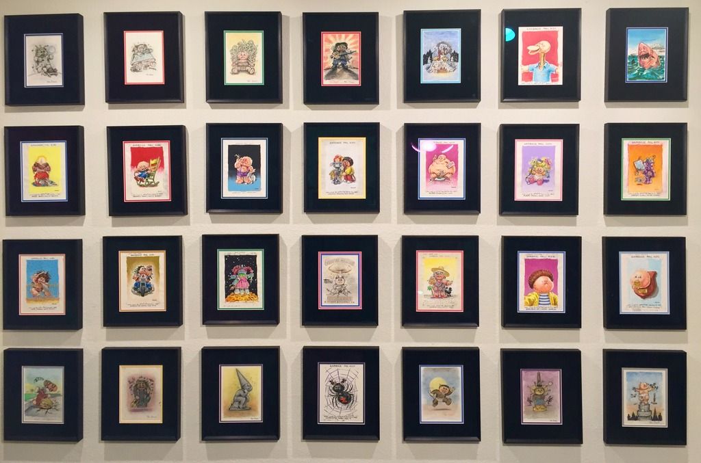 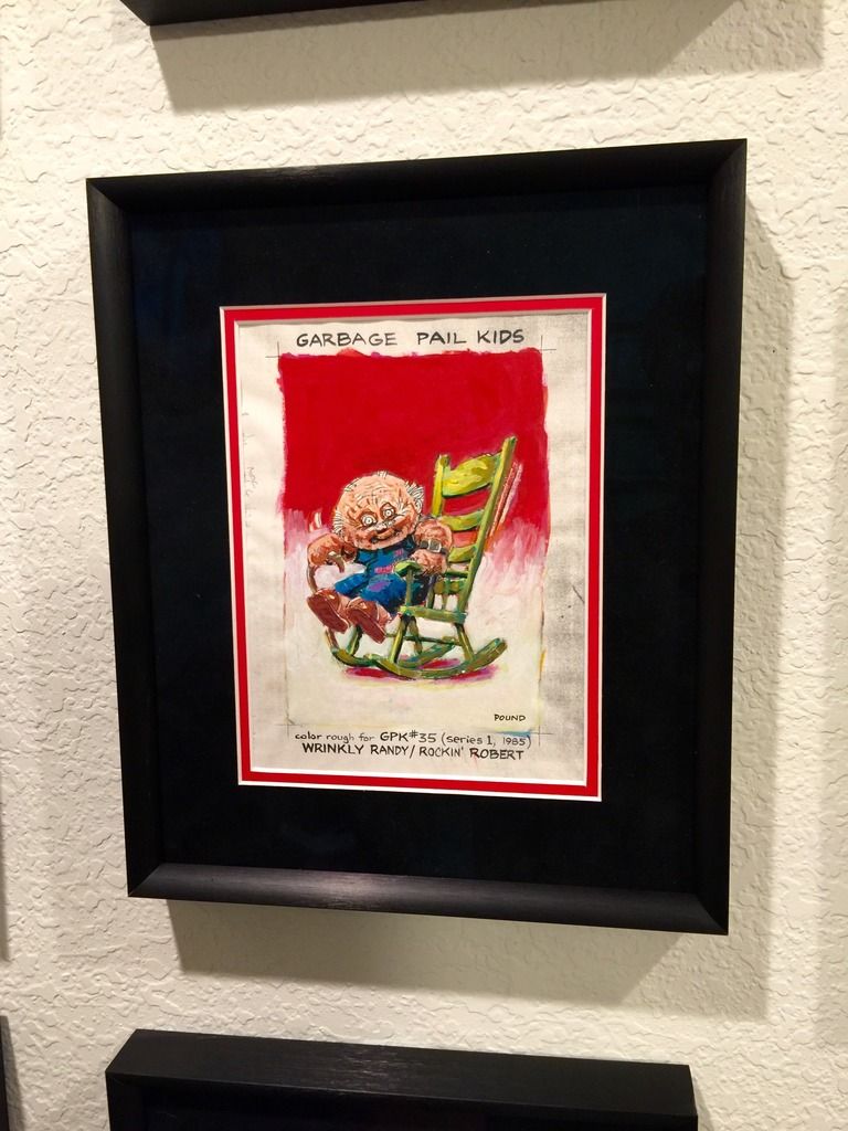
I really like the grey and black look above from Adam Bomb and may try that at some point. Super clean looking. |
|


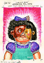
 I'd love for someone to discover the run of OS16 kids.