|
|
Post by Game8 on Aug 20, 2016 10:08:57 GMT -5
I have also tried many different things and ended up preferring the black mattes when so many are together. :)It was too busy with color mattes IMO. I also wish I went slightly bigger like Geoff I believe used for his color roughs. Not a big deal but Michaels screwed up a couple of times on me so stuck with this size. The good news is I had room for an extra row so guess it worked out. Museum glass is a must IMO too. You can see so much more detail. 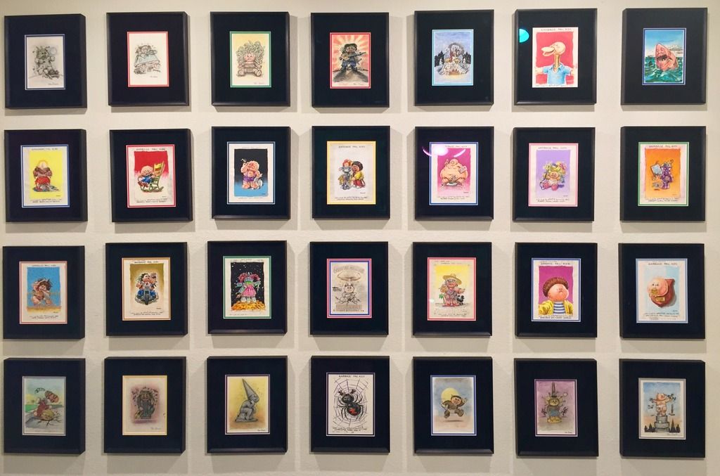 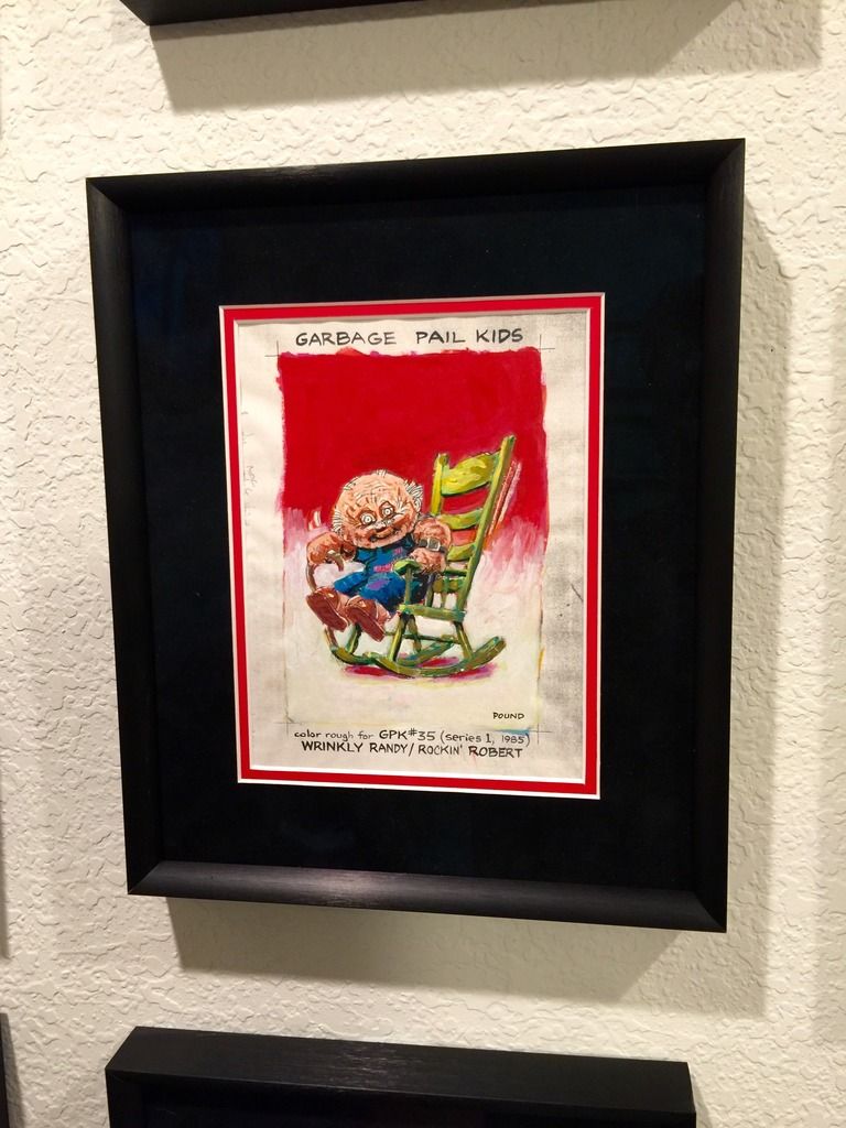
I really like the grey and black look above from Adam Bomb and may try that at some point. Super clean looking. I'm quite jealous, thats a sick ass color rough collection. |
|
|
|
Post by Wackyjackie76 on Jan 4, 2017 13:59:09 GMT -5
Does anyone display their modern GPK art with the bottom signature showing? I understand why many collectors keep all of their art the same, but I'd feel bad covering up an artists signature because it is part of the piece. Any thoughts?
|
|
|
|
Post by ANSestren on Jan 4, 2017 19:21:14 GMT -5
I cover the edges so no white unpainted part shows when it comes to finals even if it covers the sig. Roughs I don't mind the white outer edges with the writing showing when framing.
|
|


