|
|
Post by Cory on Oct 11, 2013 12:42:41 GMT -5
Cory, when you mention Sgorbions, do you mean the new artwork they made for them like this one?  I don't know what to think of it  Yeah, there were tons of terrible foreign cards that were added in with real GPK. Not just Scorbions but others as well. Gang Do Lixo comes to mind. |
|
|
|
Post by Cory on Oct 11, 2013 12:38:46 GMT -5
I agree. I don't like the party favor concept at all. The repeated eye stretch just makes it worse. The art is good but that's not enough. Yeah...his ears could've been showing popping off the sides of his head instead. Or his ear drums blowing out of his ears from blowing so hard. But, that would just be more unneeded gross-out. So yeah, the ears popping off the sides of his head would be better. Also, the only issus I have with the submarine one, is the eye should've been all grey(metal) until the actual eyeball. Yeah, a periscope rising out of the hole with an eye at the end would have been ideal. An eye torpedo would have been cool too. |
|
|
|
Post by Cory on Oct 11, 2013 12:36:06 GMT -5
I like this one. The Live Mike background colors are cool too. U6BSVzl8ZQ-g~~60_57.JPG) This one creeps me the fugg out but in a good way. The artwork is really good. Looks like the turkey is birthing a kid. I like the Basking Robin like head.  |
|
|
|
Post by Cory on Oct 11, 2013 11:49:26 GMT -5
Just no. No no no no no no no no no no no no no.  |
|
|
|
Post by Cory on Oct 11, 2013 11:35:15 GMT -5
I really dislike all of these. Both concept and art. CPK look is absent. Washed out looking  Just yuck all around  Why does this even exist? Couldn't think of a pop-up book gag better than vomit for some reason. oFIeU!8D1iBSVN8(428!~~60_57.JPG) |
|
|
|
Post by Cory on Oct 11, 2013 11:27:05 GMT -5
One thing is to use a lame background but use it in two cards that are just few numbers apart 177 & 185! C'MON TOPPS if you decide to produce 3 "Brand" new series in a year (BNS1-Oct 2012) at least try to hide lazy things like this! BTW it seems IVAN & BRENT go to the same shirt's store!!!   Yeah, shouldn't he have switched the colors around. There are a ton of green backgrounds in this release. |
|
|
|
Post by Cory on Oct 11, 2013 11:00:02 GMT -5
Talking about shoes and mittens, Cats are supposed to have paws, right? oFIeiK,TK3BSV4u1sW6Q~~60_3.JPG) Terrible card. I hate everything about it. Looks like a GPK in a Furry costume. Lame as fugg gag too. |
|
|
|
Post by Cory on Oct 11, 2013 10:57:26 GMT -5
 But it's me or this one could have waited at least one more series to be published? this one and the sub (Brent's also) in the same series, it does not look good! I agree. I don't like the party favor concept at all. The repeated eye stretch just makes it worse. The art is good but that's not enough. |
|
|
|
Post by Cory on Oct 11, 2013 10:53:27 GMT -5
Could any one establish a relation/link between the lug and the baby's body?  Usually the gag would be the person is sawing a log in their dream. I think sawing the log thing came from people snoring. They made the log literal but the concept still isn't that compelling. The art is pretty good though. |
|
|
|
Post by Cory on Oct 11, 2013 10:39:38 GMT -5
This one could have been so much better because the concept isn't terrible. The GPK look is way off and the artwork is so fuggin washed out. This is Scorbions all day long....just like that peanut one. This could fit right in with ANS2 stuff like Timid Tim and Torn Tori. Also, that's either a giant cupcake or a really small human head. I think just the lips would have been enough here. The face is ugly as fugg anyway.  I hate the tooth on this! It's the same with a lot on Bunks cards (not sure who painted this?) but quit with the single redneck bucktooth already lol Haahahah. There is a lot more to dislike than just the tooth, but I hear you on the single tooth over use. |
|
|
|
Post by Cory on Oct 11, 2013 10:35:41 GMT -5
There is a lot of hating going on in the other thread so I wanted to counter balance it a little. Post up BNS3 GPK that you think are good and why. That's if for now. I'll post more later. The only thing i'd disagree on this is the eye on the sub card, just not feeling it lol Yeah, as an abstract lover it works for me. I understand they don't appeal to everyone. Still you can't deny that it has the GPK look, even if you don't dig the concept. |
|
|
|
Post by Cory on Oct 11, 2013 10:32:58 GMT -5
Yeah, Simko could benefit from working on his hair and extremities more. He's usually off, which has been the case since forever. He does a great job on the faces though. Brent, Mark and Layron are the 3 best artists Topps has for GPK right now. Joe could get better and Im just needs to go away. I love Gross but his use of color really doesn't fit in with GPK, his concepts are usually really good though. I have zero issues with this card! The card has minor annoyances at best. It doesn't ruin the card but if you compare it to the original concept that Pound did (which happened in the BAD thread) it's very apparent Simko could tighten his stuff up a little. It could definitely be better than it is right now. |
|
|
|
Post by Cory on Oct 11, 2013 10:23:39 GMT -5
Adam Bomb/Max Stacks is good too even though Adam's shoes look weird.  I also like that card but beside the shoes the left hand is weird! It seems he has 2 pinky fingers! Yeah, Simko could benefit from working on his hair and extremities more. He's usually off, which has been the case since forever. He does a great job on the faces though. Brent, Mark and Layron are the 3 best artists Topps has for GPK right now. Joe could get better and Im just needs to go away. I love Gross but his use of color really doesn't fit in with GPK, his concepts are usually really good though. |
|
|
|
Post by Cory on Oct 11, 2013 10:15:08 GMT -5
 heres the original concept from pound to compare shoes. Also the hands seem off to me as well, like mittens Nobody could do hands like Pound or Diaz. They were the masters at it. That Pound piece just shows you how far Simko still has to go. Also, I can forgive the hands because if you ever have seen a real CPK hand they do look like mittens. Fingers sewn togehter and etc. |
|
|
|
Post by Cory on Oct 11, 2013 10:13:06 GMT -5
This is a rare miss for Brent nowadays. This one looks like it came straight from ANS7, the series that killed GPK for years. The cheeks are mouth are very reminicent of his ANS style, which I hated. The concept is average and outdated, unless those glasses have made a comeback recently...in which case I'm outdated.   |
|
|
|
Post by Cory on Oct 11, 2013 10:05:52 GMT -5
This one could have been so much better because the concept isn't terrible. The GPK look is way off and the artwork is so fuggin washed out. This is Scorbions all day long....just like that peanut one. This could fit right in with ANS2 stuff like Timid Tim and Torn Tori. Also, that's either a giant cupcake or a really small human head. I think just the lips would have been enough here. The face is ugly as fugg anyway. |
|
|
|
Post by Cory on Oct 11, 2013 9:59:04 GMT -5
Total lesbian scene with Thin Lynn and Beth Death with Glowing Amber as a voyeur. I don't like the look of Roy Bot's face in that card. But the concept is cool. Love the Bad Brad/Clark Can't crossover. Adam Bomb/Max Stacks is good too even though Adam's shoes look weird. |
|
|
|
Post by Cory on Oct 11, 2013 9:51:21 GMT -5
The hair on this is jacked up. Actually, a lot of Simko's paintings have this hair problem. The hair doesn't look like yarn and it doesn't look proportionate to the face. The faces look pretty good though. The concept is good. Examples of hair done correctly    THis is 1 thing Ive never liked with Simkos bns work. The kids hair look like that have afros. You can tell a painting he did just by that. The characters themselves look good, just not the hair The hair is so bad that I can't even enjoy the rest of the card. It looks ridiculous almost all the time. He also messes up other things slightly but it's not as noticeable. Take a look at Adam Bomb's shoes, they just look....weird. Everything else is great...because there is no hair. |
|
|
|
Post by Cory on Oct 11, 2013 9:30:29 GMT -5
Changed the title of this thread so I could sticky it next to THE GOOD
|
|
|
|
Post by Cory on Oct 11, 2013 9:28:08 GMT -5
There is a lot of hating going on in the other thread so I wanted to counter balance it a little. Post up BNS3 GPK that you think are good and why. I'll start with these: I really like the concept and art on this one. This is one of the best cards in the set. It's one of those cards that you'll remember being in BNS3. It's BNS3's Bony Tony, Scalped Ralph, Jordan Nuts, etc. 0FIZ,tNuo+BSVv6Pw5f!~~60_3.JPG) This is one of my favorites of the set. The art is perfect and the concept is great. You all know I hate bodily function gags unless they are done right. I think this is the right way to do them. MFIcRi3BoEBSVKwwTQEQ~~60_57.JPG) The concept are art are really good on this one. I think this one would be even better if the background would've had more detail. Some bright green OS grass and maybe a yellow or orange sky.  This is a really cool concept and the art backs it up.  The concept on this one is pretty good but the art is better. This is a very good GPK. It's not a GPK that is super memorable but it doesn't take away from the set. This is one of the best looking cards I've seen in the BNS to nail that CPK look. Great job on this one! EFIoZF1YdVBSV1D5Fq!w~~60_57.JPG) I love the abstracts and this card looks great. A decent gag on the periscope.  I really like this concept and the art look is good. It really could have used brighter colors though. Legos always have very bright colors and these look too dark. But still, it's a pretty good card and the concept carries it.  This one is great. The concept is good and the art is great. The hair is perfect and face are perfect.  That's if for now. I'll post more later. |
|
|
|
Post by Cory on Oct 11, 2013 8:33:17 GMT -5
|
|
|
|
Post by Cory on Oct 11, 2013 8:11:46 GMT -5
This one looks like it was painted with butter. A decent filler concept but the art is really bad. No GPK face and looks like watercolors.  |
|
|
|
Post by Cory on Oct 11, 2013 8:02:45 GMT -5
This is so funny. The GPK face looks great but there isn't enough detail. This is an old Baked Jake fan art concept. I'll post that one for comparison purposes later. His was cool. Night with lightning, rough waves and attacking a boat. Here is the Baked Jake Sea Serpent concept. I think if they would have done it more like this it'd be one of the best in the series. I don't hate the current BNS3 card (the art is very tight and looks GPK) but it's really really plain. Topps is going a little too far with their plain backgrounds, even the OS had a little something going on to make things interesting from time to time. 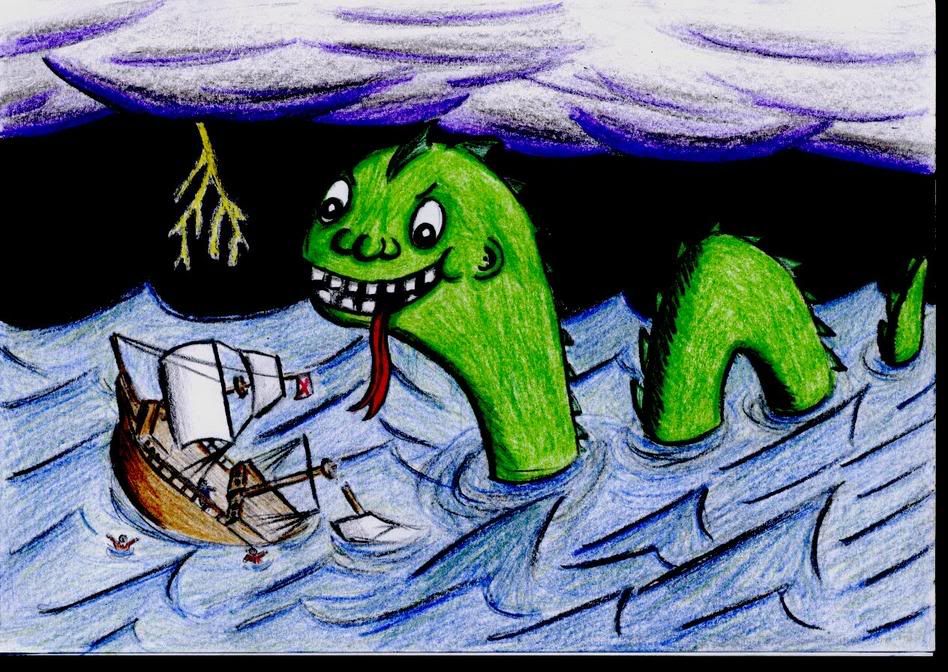 Also, just for fun, here is another Baked Jake concept that is similar to a BNS3 concept. (not saying it was stolen or etc.) This card should be in the set. It's painted perfectly and the concept is good.  |
|
|
|
Post by Cory on Oct 10, 2013 19:02:09 GMT -5
This is so funny. The GPK face looks great but there isn't enough detail. This is an old Baked Jake fan art concept. I'll post that one for comparison purposes later. His was cool. Night with lightning, rough waves and attacking a boat. |
|
|
|
Post by Cory on Oct 10, 2013 14:23:14 GMT -5
This has to be the worst thing I've seen since Egg Sheldon. The concept for this isn't terrible but the artwork is horrible. Who's going to stand up for this artwork?  I WILL.........Not it's too washed out it doesn't pop I like the concept but the execution is lacking in the final some darker vibrant colors and it would be pretty cool. You didn't stand up for it at all, lol. This one reminds me of those terrible foreign cards that get inserted with real GPK. |
|
|
|
Post by Cory on Oct 10, 2013 14:11:10 GMT -5
Look at Galloping Glen. HAHAHAHAHHAHAHAHAHHAHAHAHAHAHAHAHAHAHA. The tongue roping GPK has always sucked so no change there.  |
|
|
|
Post by Cory on Oct 10, 2013 14:03:24 GMT -5
This has to be the worst thing I've seen since Egg Sheldon. The concept for this isn't terrible but the artwork is horrible. Who's going to stand up for this artwork? |
|
|
|
Post by Cory on Oct 10, 2013 13:48:44 GMT -5
This one even does not have a concept is just a good example of copy/"change a little"/paste...I guess Saul still has the gum on his shoe but is covered with the card's name...  Although this one doesn't do much for me, the concept makes sense. Tiny Tim has a penchant for getting stuck to sticky things, be it gum or in a web, and facing a certain doom! My question is, how did he escape his gum predicament?!? The concept on this one makes sense but they used that really terrible rejected spider Bunk GPK from back in the day. DiDi is a Black Widow and the spider in this is a Tarantula or some bigger fatter spider. It looks like s**t overall. DiDi T is better than this. |
|
|
|
Post by Cory on Oct 10, 2013 13:46:22 GMT -5
I want to open this thread not to attack any particular artist but after seeing so many rejected concepts, I would like to know if you were Topps Editor which BNS3 cards should have made the cut according to you, without giving any reasons if you like just imagined that you have this kind of power... To start, to me this one shouldn't  I really like this concept. It's very original, cool and fun. The art is what's hurting this one. It's not tight enough. The tape and hand look too washed out and watercolorish. The face on the tape is way too stretched out and just doesn't look good. The face on the tape roll looks fine though. The concept looks a lot better on Dave's pencil concpet than the final art. I saw one last night where I was thinking WTF happened and why does this exist. I'll post it in a few. |
|
|
|
Post by Cory on Oct 9, 2013 15:58:05 GMT -5
OS11 is arguably the hardest series to get a decent Pound from. It's by far the weakest series in the OS in my opinion. OS13 is much easier, hopefully you got a good one. That's funny series 11 is one of my favorite series because it was my first exposure to garbage pail kids. I came really late to the game so it has a special place in my heart. To me series 13 is a worse series. probably my least favorite The series 13 I picked up hasnt been for sale since topps auctioned it off. Should get it by the end of the week I'm surprised you stuck around with GPK if you started at OS11. Out of all of the post CPK series only OS1O and OS15 are decent IMO. 11-14 were rough overall. Too much Bunk and Warhola just doing whatever the fugg. OS16 would have been good too. |
|