|
|
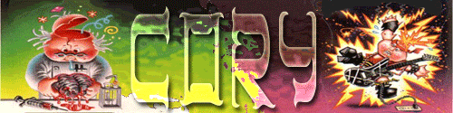
Post by rockholt on Dec 14, 2017 13:14:19 GMT -5
|
|
|
|
Post by damien308 on Dec 14, 2017 17:33:48 GMT -5
...........................weak
|
|
|
|
Post by 3mileMalcolm on Dec 14, 2017 18:17:27 GMT -5
All the art is getting better, no doubt.
|
|
|
|
Post by DJR on Dec 14, 2017 22:23:55 GMT -5
Are those Wacky Packages or GPKs...on a few, I'm having a hard time telling the difference. #Topps$ucks
|
|
|
|
Post by LiveMike on Dec 15, 2017 0:18:51 GMT -5
pass
|
|
|
|
Post by jamfish on Dec 15, 2017 10:17:09 GMT -5
Is the Christmas Tory and ELLA-Tric character supposed to be a parody of Turned on Tara and Tiffany Lamp from series 4
|
|
|
|
Post by damien308 on Dec 16, 2017 1:07:24 GMT -5
the snow man ........... it simply looks like a cartoon of snowman ......... nothing "gpk" about it.
|
|
|
|
Post by CollectiblesWorkshop on Dec 16, 2017 19:58:20 GMT -5
Is Christmas Tory a parody of Turned On Tara from OS4? No, Topps would sue the artist they hired for making a parody of a parody and "trade dress" infringement. |
|
|
|
Post by Cory on Dec 17, 2017 13:27:27 GMT -5
I like the lamp one. Brent did a great job with it, even though it's a concept that has been done before. The Grinch parody is good too, the background is nice. I hate the rest of them. They don't look like GPK at all.
|
|
|
|
Post by rusVan on Dec 18, 2017 22:55:16 GMT -5
Both of Brent’s are good! The lamp one puts Bunks version to shame.
|
|
|
|
Post by Mr. 1985 on Dec 21, 2017 18:23:28 GMT -5
The lamp and Grinch are great, the wacky packs are decent too. But, not that sold on the others.
|
|
|
|
Post by rusVan on Dec 23, 2017 20:46:12 GMT -5
Eagerly awaiting to hear how many of these sets Topps sold, NOT!
|
|
tony
Cabbage Patch Kid

Posts: 34 
|
Post by tony on Dec 24, 2017 6:09:39 GMT -5
Thought I'd leave my two cents.
The arts great although it is a weaker set then the last few and I was initially disappointed. but they have grown on me.
In order of my favorites:
Rud-Off - My number one is one that seems to not be getting love??? The art is great, the colors I can tell will pop on the card, the face is cpk enough (as much as say the classic OS venus fly trap - Green Dean), and the idea of his glowing nose being bloodily ripped off to replace a bulb is awesome. The name I had to take to google to find out Rud can mean red/reddish, but is also a Nordic surname or can be short for Rudolph.
Christmas Tory - Great to have a GPK lamp from the classic "A Christmas Story". I do dislike the use of previous characters rather then new, as its lazy, but this may be a Topps decision. Michael Bernard said that on his Kit E. Pool card about the gorilla in the kiddie pool viral video, he wanted to do his own version of the gorilla but Topps forced him to use Bananna Anna.
Kris Kring L. - Fun card, like it, but not sure about the face, probably looks boss in hand.
Beck The Halls - Not huge on vomit/poop cards, but this could easily fit in the ANS series in content although the kid looks more cpk then that series was doing. Like the card.
Frost TY - I have to reserve judgement on this one as all I have is the pictures from gpknews and topps to go by and blow up, which only gives me a somewhat blurry picture. This may be more cpk/gpk when seen in better circumstances.
All in all, I do not LOVE this set as much as some other recent ones but still like it and am glad to have it in the collection.
|
|
|
|
Post by Cory on Dec 24, 2017 10:16:18 GMT -5
Here is an amazing GPK they didn't publish in this online set. This is the best looking one of them all and it's the best concept too. I'd have gone with this concept in an instant, even before seeing the final art. Matt from geepeekay posted this on facebook. The artwork was done by Michael Barnard. 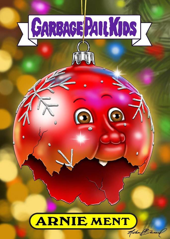 |
|
DRMNBIG
Cabbage Patch Kid
Posts: 35
|
Post by DRMNBIG on Dec 24, 2017 15:13:10 GMT -5
Here is an amazing GPK they didn't publish in this online set. This is the best looking one of them all and it's the best concept too. I'd have gone with this concept in an instant, even before seeing the final art. Matt from geepeekay posted this on facebook. The artwork was done by Michael Barnard. Wow, How in the hell did that get rejected?? Reminds me of something I love and don't see A lot of anymore..A GPK. Shame on Topps.. |
|
tony
Cabbage Patch Kid
Posts: 34
|
Post by tony on Dec 24, 2017 16:20:48 GMT -5
Absolutely a shame this was not included. Hopefully for the New Years set we may be so lucky. GREAT work, Michael Bernard is quickly becoming a favorite of mine.
|
|
|
|
Post by ADAM Bomb on Dec 25, 2017 12:00:45 GMT -5
Here is an amazing GPK they didn't publish in this online set. This is the best looking one of them all and it's the best concept too. I'd have gone with this concept in an instant, even before seeing the final art. Matt from geepeekay posted this on facebook. The artwork was done by Michael Barnard. Wow, How in the hell did that get rejected?? Reminds me of something I love and don't see A lot of anymore..A GPK. Shame on Topps.. Could it be Topps actually wants painted artwork and not computer drawn? This is an awesome piece! But I prefer there being actual paintings. I HIGHLY doubt that was their reason but a little part of me wishes they cared for a reason like that. |
|
|
|
Post by Cory on Dec 25, 2017 12:46:31 GMT -5
Wow, How in the hell did that get rejected?? Reminds me of something I love and don't see A lot of anymore..A GPK. Shame on Topps.. Could it be Topps actually wants painted artwork and not computer drawn? This is an awesome piece! But I prefer there being actual paintings. I HIGHLY doubt that was their reason but a little part of me wishes they cared for a reason like that. They rejected the concept, the art was done after |
|
|
|
Post by CollectiblesWorkshop on Dec 26, 2017 15:45:26 GMT -5
GREAT work, Michael Barnard is quickly becoming a favorite of mine I've been a fan of Barnard since his Nut Job James Comey piece blew away all other Trumpocracy cards in the series last May, but his work conflicts a lot of GPK "purists" because it is digital and not hand-painted, though he is a great sketch card artist as well. |
|
|
|
Post by ADAM Bomb on Dec 26, 2017 21:56:55 GMT -5
Could it be Topps actually wants painted artwork and not computer drawn? This is an awesome piece! But I prefer there being actual paintings. I HIGHLY doubt that was their reason but a little part of me wishes they cared for a reason like that. They rejected the concept, the art was done after It was more of a rhetorical question or thought. My point was if they would ever care about knowing that the art would be digital or painted and hopefully rejecting a piece because of style, not only because of concept. But yeah colin wouldnt do anything like that. Lol |
|
|
|
Post by 3mileMalcolm on Dec 28, 2017 22:16:17 GMT -5
I’ll take digital, if it looks this good and GPK-like.
|
|
tony
Cabbage Patch Kid
Posts: 34
|
Post by tony on Dec 31, 2017 20:47:05 GMT -5
I agree with 3milemalcolm And Adam Bomb!!! I want my majority cards actually painted,..BUT would not mind at all if say one artist like Barnard did a handful in digital. As a longtime collector I look at my cards in whole now and then (for me OS 2 - present) and although the traditional gpks are amazing, the "oddities" are refreshing when taken in context. For instance, I am a huge fan of David Gross's/ At first, I did not know what to make of his sketchy, almost unfinished looking gpks. But in sets, there were only a handful of those and I came to look forward to them. I, like others. have a distaste for Im, but due to certain reasons, her art became the norm which was NOT what we wanted. I wonder if she had had only a handful, if I might have grown to like those red ass cheeks? Just wondering out loud  |
|
|
|
Post by 3mileMalcolm on Jan 1, 2018 8:19:56 GMT -5
I don’t like the unfinished GPK style of DG or the work of IM. I think GPK deserves better. But this is just my opinion , so it’s to be taken lightly, not as fact.
|
|
|
|
Post by rockholt on Jan 10, 2018 22:11:53 GMT -5
|
|