|
|
Post by Mojo on Jun 3, 2005 10:50:26 GMT -5
BakedJake: " Thanks! ;DThis one is Blown-Up Blake / Singed Simon  " 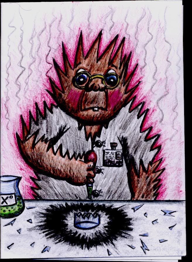 |
|
|
|
Post by Mojo on Jun 3, 2005 10:51:20 GMT -5
BakedJake: " Thanks Cory. I just completed this one. He's called Mirror Ball Saul / Disco Des. " 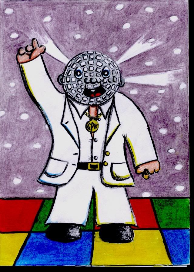 |
|
|
|
Post by Mojo on Jun 3, 2005 10:52:36 GMT -5
BakedJake: " Thanks! This drawing I did a while ago to advertise GPKC. " 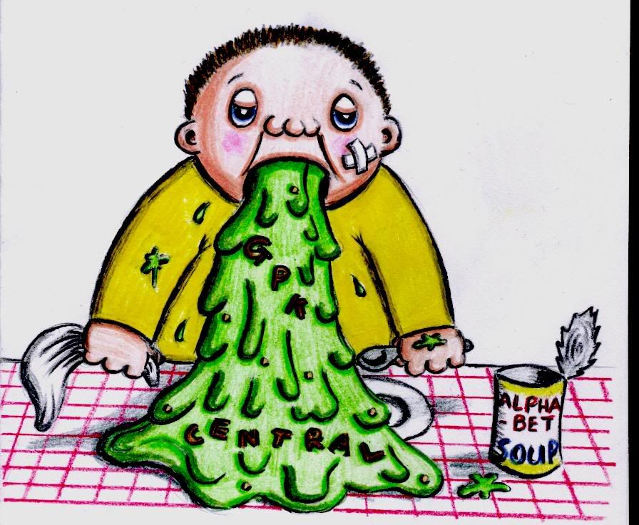 |
|
|
|
Post by Baked Jake on Jun 6, 2005 17:08:33 GMT -5
This is my new GPK. He's called Gil Drill. ;D 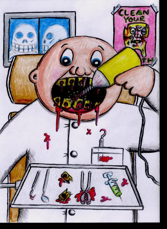 |
|
|
|
Post by Cory on Jun 8, 2005 11:58:02 GMT -5
This is for everyone that missed it's greatness the first time. I will be creating a Baked Jake skin very shortly. I might have time to do it tonight. Jake Said: I drew this GPK today that I thought you might be able to use as a banner somewhere on the site. I left a space under the character so something can be written there.  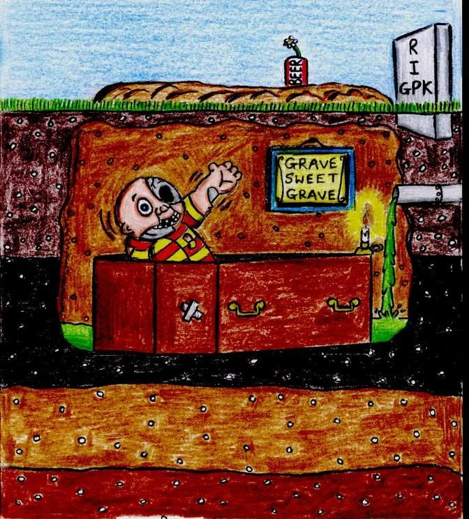 |
|
|
|
Post by Baked Jake on Jun 11, 2005 1:22:56 GMT -5
This one's called Smacked Jack. 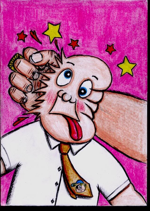 |
|
|
|
Post by Baked Jake on Jun 12, 2005 18:17:55 GMT -5
Here's a new abstract GPK, called Earring Erin. Morbid, I've not forgotten about the Phoney, I'm going to do that next. 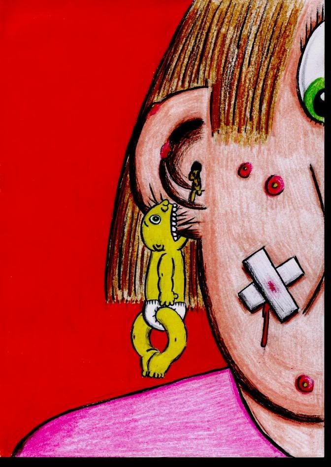 |
|
|
|
Post by Sniglet on Jun 15, 2005 19:35:11 GMT -5
well, here is my first drawing in a while, i was hit with inspiration and had to draw before it escaped. this is based off of a dali painting, i can't remember the name but it's something to do with William Tale. the position of the GPK is the position of the dude in the painting. THAT IS NOT HIS PENIS!!! that is his knee cap and his shirt says Dali.  |
|
|
|
Post by Baked Jake on Jun 16, 2005 22:56:09 GMT -5
Your art GPK inspired me to do one of my own, Sniglet. This is Pukey Pablo. 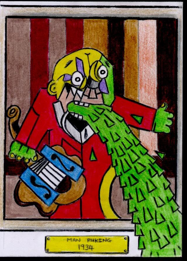 |
|
|
|
Post by Baked Jake on Jun 22, 2005 12:56:52 GMT -5
Here's a GPK I just finished. This one's called Crystal Ball / Claire Voyant. 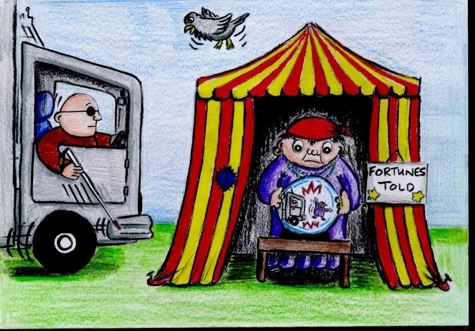 |
|
|
|
Post by Baked Jake on Jun 26, 2005 18:01:01 GMT -5
Not yet. This one's called Chad O. Boxer. ;D 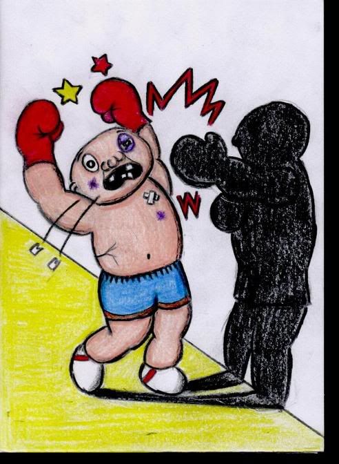 |
|
|
|
Post by Baked Jake on Jul 10, 2005 11:20:35 GMT -5
I completed this one yesterday. He's called Many Hans / Manny Hands. 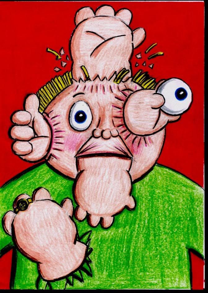 |
|
|
|
Post by Sniglet on Jul 14, 2005 21:03:06 GMT -5
i'm currently making an ANS "bust" collections. i'm going to try and make this a huge project and would like you guys to give me some names of ANS characters faces that you would like to see. here is the first part that i made today.  |
|
|
|
Post by Baked Jake on Jul 15, 2005 19:27:10 GMT -5
This is my latest GPK. He's called Hans Up / Bank Robin. 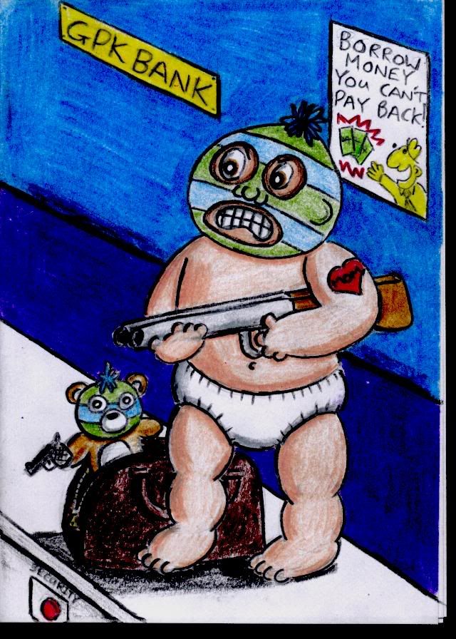 |
|
|
|
Post by Sniglet on Jul 17, 2005 22:32:05 GMT -5
i added some more faces today.  |
|
|
|
Post by Baked Jake on Jul 23, 2005 17:04:38 GMT -5
I've been away for a while, because I've been so busy with work, but here's another new GPK. This one's called Floating Ivan. 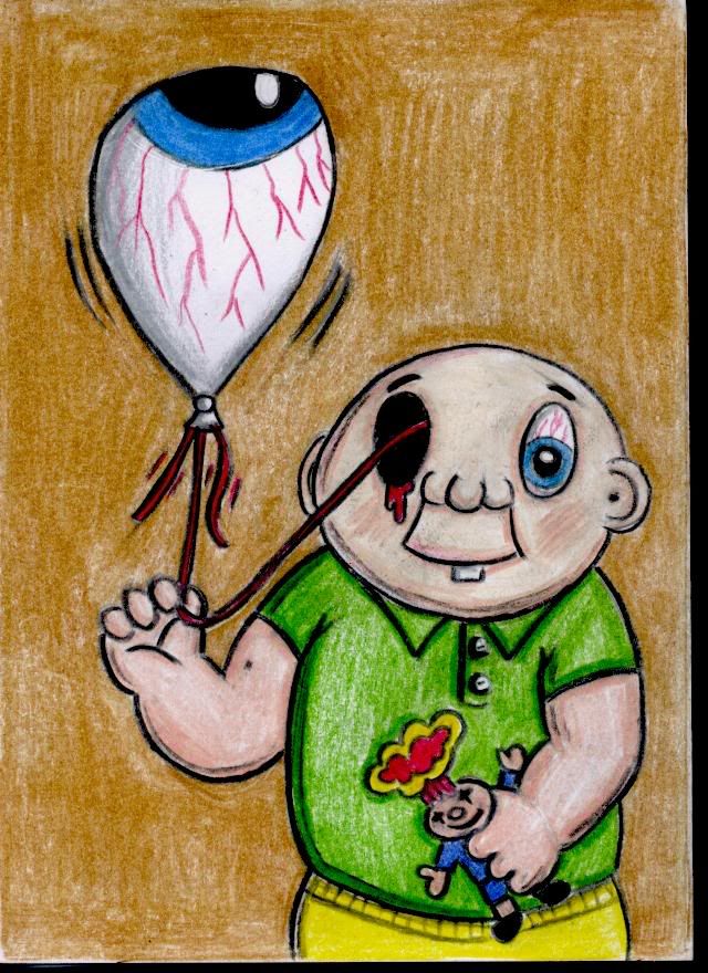 |
|
|
|
Post by Baked Jake on Jul 28, 2005 21:52:51 GMT -5
Thanks Cory. This new is called Billy Goat / Smelly Shelly. 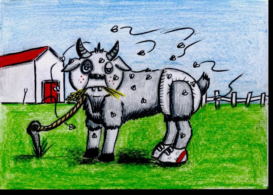 |
|
|
|
Post by Cory on Aug 8, 2005 22:55:53 GMT -5
I'm opening this thread back up now that the board is fixed. Baked Jake wrote: This one is Lemon Ada / Sour Grace. 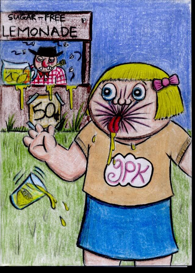 |
|
|
|
Post by Sniglet on Aug 31, 2005 20:23:49 GMT -5
i haven't drawn a GPK in a minute! here is one i tried, this was supposed to be my rough draft just to get the concept down. here are the negatives. 1. limbs too long 2. legs don't look like they're running, looks like he's wobbling around 3. he has a neck!!!  |
|
|
|
Post by Sniglet on Sept 17, 2005 15:20:22 GMT -5
Well guys, this is one of my best GPK i think. I stuck to all the requirements that TOPPS requests for concept art. I measured the size by the concept art i received from Keith Webb. I also followed his style of going along the outside of the character with a thick black marker and filling in the inside with a think black pen. I put a lot of effort into this one and i don't even have a name. In case you can't tell what's happening, he cut his face off and put it on his new Mr. Potatoe Head aka Veggie Head (see the box towards the bottom. I need all of your opinions on this one because if ya'll think this style is nice, then this is how i'm going to start practicing. I put alot of time into it and want your opinions. So here he is...
??
P.S. should i remove the bandaid on his face? i did it in pencil in case it was too much. What are the weak points here? what are the strong points? what could have been done differently? I draw to please you guys, so give me that feedback! Also, the size and characteristics were totally inspired by series 11. this is my new favourite series and so far i think it is the bset
|
|
|
|
Post by Cory on Sept 17, 2005 16:10:28 GMT -5
I love the concept Sniglet. I love these brutal GPK. Now I will attempt to answer some of your questions. 1 - Character Placement - Since you are really trying to do this like Topps would want to see it I'll give you a few tips. Your GPK isn't within the borders of where they want the image to be. Topps wants the center of activity to be directly in the center of the card. You have two focal points and they are spread out on the card. The reason Topps wants it in the center is because of the die-cut. When a sticker is peeled you should be able to see almost all of the GPK. If a die cut was placed on yours some of both of the characters would be lost. 2 - Style - I noticed that you really tried to get the chubby GPK look this time around. That's cool. I would recommend that you look at the John Pound model sheet for how to draw a GPK. When you look at the sheet make sure you look at the face. 80% of what makes or breaks a GPK is the face. You want to get the eyes right (kind of round with and upwards curl at the bottom), you want chubby cheeks (which is the reason the eyes are curled at the bottom), you want to get a sunk in mouth and you want to get the ears the right size and put in the right spot on the head. I think the sunk in mouth would be the hardest thing to get down. The body is shown well on his model sheet as well. It should be a bit chubby w/ no neck. 3 - Purpose of art - If you are just trying to be a concept artist then only pay attention to number 1. If you want to be a GPK artist then pay attention to both. As a concept artist your job is to give the artist a rough idea of what they should be doing with the final art. Once they get your concept they re-work it to look like a GPK and go through the approval process. 4 - Concept - I really like this concepts. I think it would be a lot better if the GPK had his back facing toward the audience with his body kind of turned around looking back at us with a mutilated face. It would also be at kind of a top view. See Judd Flood from ANS1 for what I'm talking about. The Mr. Potato Head would be on a table in front of the GPK with his body parts all over it. Also, I don't know if I'd rip the skin off. I'd just have the eyes popped out, nose ripped off and Teeth (like dentures) pulled out and inserted into the Potato head. They way you have it now it looks like the GPK has two sets of eyes because Potato head has a set and the GPK has a set. I hope this is the kind of feedback you wanted. If it's too much just let me know.  |
|
Deleted
Deleted Member
Posts: 0
|
Post by Deleted on Sept 17, 2005 16:13:17 GMT -5
Love snig's potato head idea.
|
|
|
|
Post by Sniglet on Sept 17, 2005 16:44:07 GMT -5
Now that's what i'm talking about! Excellent feedback, that is what i wanted! I will listen and take your words into consideration. I will redraw this particular GPK several times if i have to get as near perfect as possible.
Because i can not paint and i am working specifically on drawing i am more aimed at being just a concept artist. Being able to paint a GPK (or anything for that matter) is a whole nother ball field i am not yet qualified to enter.
I'm off to check out that sheet that pound had done for series 10 at barron aarons i believe. Also Cory, do you know a place where i can view concept sketches other than John Pounds site?
Thanx again for your honesty both Cory and Luis this is what i need so that i can improve my skills.
P.S. i also find that drawing the sunken lips very very hard. i'm not too good at it actually. Any suggestions Mr. Luis?
|
|
|
|
Post by Cory on Sept 17, 2005 17:46:01 GMT -5
I'm not talking about the Series 10 model sheet done by Tom Bunk all of those years ago. Those models suck. I'm talking about the one John Pound did for ANS4. See Barron Aaron's ANS4 page. You might be able to get a bigger scan from Wayne.  Wayne has quite a few of Jay Lynch's concept sketches on his site in the ANS card sections. |
|
|
|
Post by Sniglet on Sept 19, 2005 21:33:46 GMT -5
i love the feedback guys! love it! it points me where i need to go. i agree zoop the potatoe head should be on a surface. i've gotten the opinions of 3 artists and many friends and i am going to rework "Tommy Tater". i also received a letter from Mr. Jay Lynch suggesting i get a quill pen and some india ink. he pointed out that the felt tips turn purple over the years and can ruin a drawing.
my current focus has been on perspective. though most GPK don't use hard perspective (like the game cards), i still think that it gives them an interesting appeal. This next guy i have been working on for a few days and just inked him up tonight. He is reworked from one of my others a few shots up.
??
i know the forshortened leg looks kinda shabby and it took me quite some time to get it that shabby lol.
|
|
|
|
Post by Sniglet on Sept 20, 2005 21:34:07 GMT -5
Here is another. This one left me feeling discouraged though, but because it was an idea i didn't scrap it. I discontinued the use of my felt pens and used just a standard pen. I can not WAIT till i get one of those quill pens!
??
|
|
|
|
Post by Sniglet on Sept 21, 2005 21:12:22 GMT -5
Here's yet another. I like this one. I had to use the felt tip on it until i'm able to get a better pen because i like the way it makes the GPK look. I have several names off to the side and i'm going to call him Cowell Movement  |
|
|
|
Post by Sniglet on Sept 24, 2005 21:52:04 GMT -5
Here is my first attempt at using a quill pen. i just went over this GPK that i drew about 7 months ago with the quill pen on the outside. my hands kept getting into the fresh ink and i would smeer it everywhere. so here is the first of many more to come.  |
|
|
|
Post by Sniglet on Sept 25, 2005 20:43:24 GMT -5
here is my best inking so far. i drew this guy earlier this week and was afraid to go over him until i felt comfortable with it. So here it is, the names on the side were all that i could muster.  |
|
|
|
Post by Baked Jake on Sept 26, 2005 17:49:17 GMT -5
Here's the first piece of GPK art I've done in ages! He's called Eye-catching Ivan. 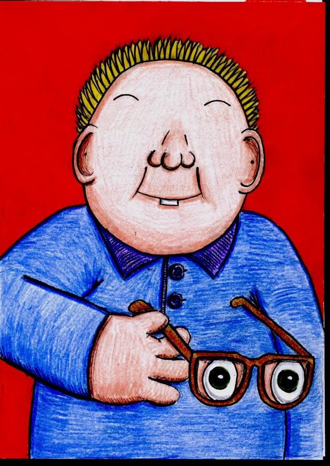 |
|


 "
"