|
|
Post by greghoriblue on May 6, 2009 13:14:35 GMT -5
And I forgot to ask you before - is Bender Construction a walnut that is being cracked? I really like the nose in it!! No it is a part of the bender. But it is a flexible bender  ( I don't think this is exist) Over the top of its head it is a pipe Maybe I will ad its hand under the hand of the plumber. |
|
|
|
Post by Thabearrocks on May 6, 2009 19:13:01 GMT -5
Thanks Mike!! Hopefully the next one will turn out a little more pro looking. I think maybe I should buy some better paint & brushes... and practice some more!  |
|
|
|
Post by greghoriblue on May 31, 2009 2:15:57 GMT -5
Hi! For June Here is: SKULL Tracy 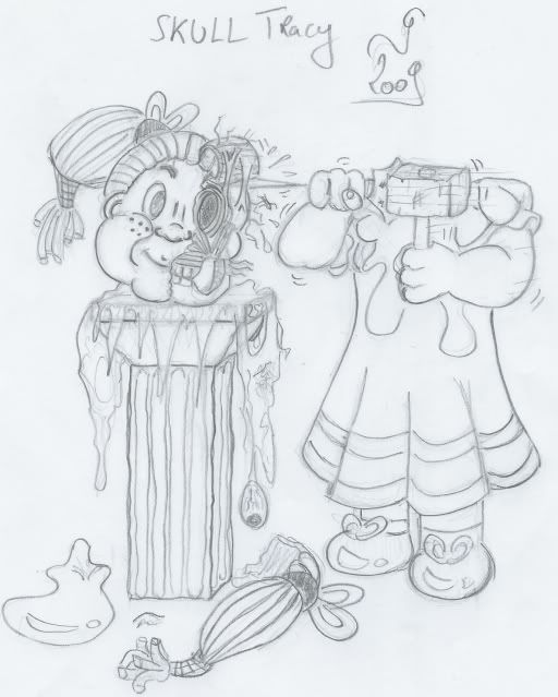 |
|
|
|
Post by greghoriblue on Jun 24, 2009 11:04:19 GMT -5
For July here is a little wink to clark CAN'T Bruce WANE/ THE BLAKEST Knight 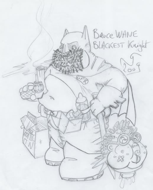 |
|
|
|
Post by Sniglet on Jun 25, 2009 21:37:38 GMT -5
I think this is the best one you've posted so far.
|
|
|
|
Post by greghoriblue on Jun 27, 2009 5:42:15 GMT -5
Thank you.
I really like it too.
|
|
|
|
Post by greghoriblue on Aug 2, 2009 6:59:45 GMT -5
Hi everybody; No drawing of mine until the end of October. But I will post a full color. Have a nice hollidays. funkerfrank: I don't forgotten you... |
|
|
|
Post by greghoriblue on Sept 15, 2009 11:28:24 GMT -5
Hi everybody, As promised here is the color rough of Kit BOXER: 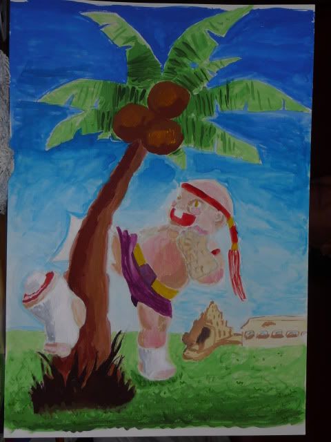 Let me know your feeling before I begin the finl art. |
|
|
|
Post by greghoriblue on Sept 16, 2009 6:25:52 GMT -5
Here is an inked version of the color rough 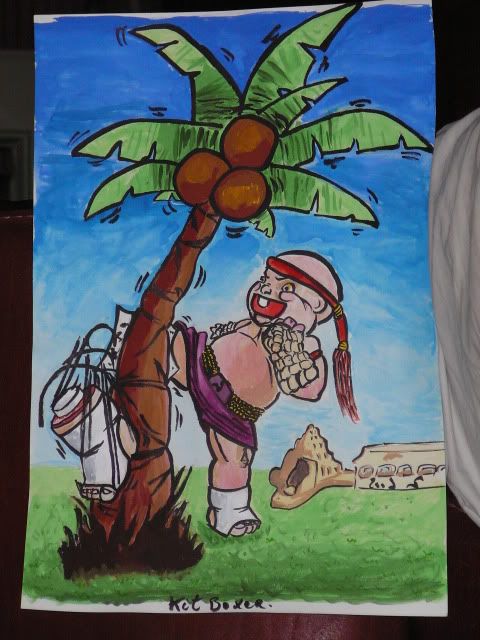 |
|
Deleted
Deleted Member
Posts: 0
|
Post by Deleted on Sept 17, 2009 20:49:46 GMT -5
Here is an inked version of the color rough  Nice job greghoriblue! -TCT |
|
|
|
Post by greghoriblue on Sept 18, 2009 3:15:21 GMT -5
Thank you
|
|
Deleted
Deleted Member
Posts: 0
|
Post by Deleted on Sept 18, 2009 15:27:54 GMT -5
|
|
|
|
Post by Thabearrocks on Sept 18, 2009 20:43:05 GMT -5
Awesome work greghoriblue!! What kind of paint did you use?? I think it looks great as it is - I am excited to see the final!!
|
|
|
|
Post by greghoriblue on Sept 19, 2009 1:44:58 GMT -5
@tct. Yes, I was inspired by the movie Kickboxer. Firstly I wanted to reproduce the scene of the movie when Kurt SLOAN (J-C VAN DAMME) was trainning against a palm tree. Then for this original color rough I wanted to get closer to a real traditional thaï Kickboxer. And I was inspired by Tong Po (M. Qissi). At last for the final art I will do a mixt of both. Thabearrocks. Thank you. I have used gouache on a A3 paper. I am soon going to post the final art |
|
|
|
Post by Cory on Sept 20, 2009 21:30:00 GMT -5
good job greg.  |
|
|
|
Post by greghoriblue on Sept 21, 2009 2:55:14 GMT -5
Thank you.
I will post the final art during next sunday
|
|
|
|
Post by greghoriblue on Sept 28, 2009 13:23:31 GMT -5
Here is the final art of Kit BOXER 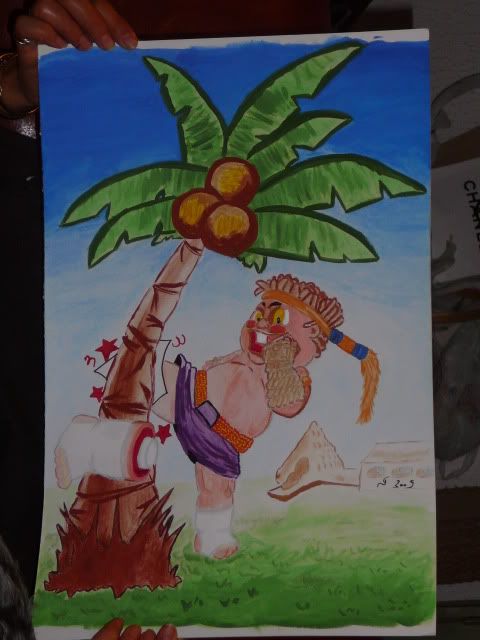 |
|
|
|
Post by Mixed Up Mitch on Nov 8, 2009 16:55:15 GMT -5
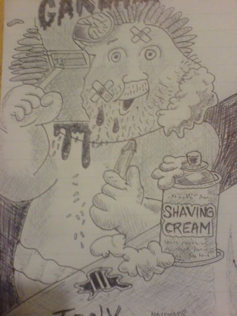 A biro skecth, I did before lunch |
|
|
|
Post by greghoriblue on Dec 29, 2009 10:36:32 GMT -5
Hi everybody! Firstly here is a full color concept: FIRED Tom: 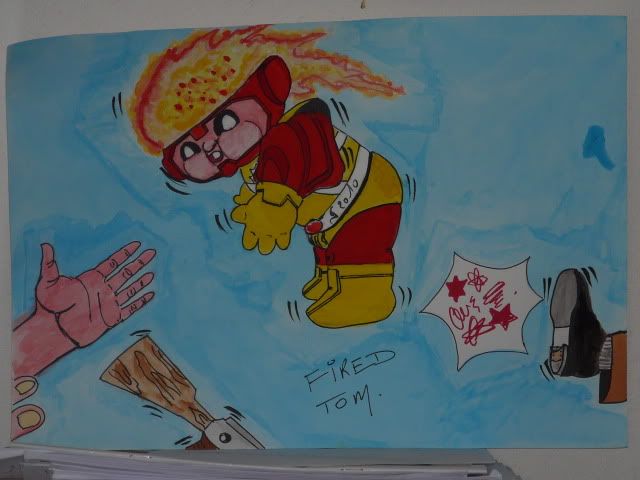 At last I wish all members of GPKU an happy new year. |
|
|
|
Post by Gpk Customs on Dec 29, 2009 12:30:00 GMT -5
Hahah that's great! Thanks for sharing.
|
|
|
|
Post by greghoriblue on Dec 30, 2009 1:38:20 GMT -5
Thank you subgenius37.
I really like your avatar! Who drew it ? Do you have an extern link to this drawing ?
|
|
|
|
Post by Gpk Customs on Dec 30, 2009 11:54:20 GMT -5
|
|
|
|
Post by greghoriblue on Dec 31, 2009 5:33:34 GMT -5
Thank you.
|
|
|
|
Post by rusVan on Jan 15, 2010 23:17:18 GMT -5
Here is the final art of Kit BOXER  Like it Greg, painting is tough isn't it, lol! I have an idea for a GPK that's currently in concept sketch stage myself... One thing though, I kinda wonder if something couldn't have been done with the coconuts in the tree.... as of now they balance the design and act as a symbol, but they are a bit distracting, and besides: what's the point of him kicking a tree in the first place? Maybe a follow-up sketch could show the coconuts exploding, or falling, or anything. Lol, now, animating the coconuts would be more distracting, but it could also make the card more exciting! Keep up the great work Greg! Have you ever had art classes(outside of Highschool and grammer school)? Your work has better form than it did before I was banned. I've enjoyed seeing what I've missed from you!  |
|
|
|
Post by rusVan on Jan 15, 2010 23:29:46 GMT -5
Who is that character?  Is that a superhero.  Is anybody SICK of superheros besides me? There're so 2000s and flat-out g**. I hate comicbooks too. I hope hollywood can start finding some real heros this decade. Anyway, I actually like the concept(someone getting fired), but the composition is primitive. Do you do thumbnail sketches to plan your comps, or do you commit 100% to your gut and first vision and wing it? Some artists can pull the latter off with grace, but I love developing compositions too much to rush a design. Compositions are puzzles that artists solve to communicate messeges and give meaning to their art. So basically, I'd deffinately try a new perspective on the kid and the boot. Not sure what that hand is doing there.. interesting. Btw, if I didn't care about your work then I would bother commenting on it-Thank GOD you are sharing your work, it's more than most of us can say  ! Keep it up bro!! Hi everybody! Firstly here is a full color concept: FIRED Tom:  At last I wish all members of GPKU an happy new year. |
|
|
|
Post by greghoriblue on Jan 16, 2010 13:54:59 GMT -5
Hi rusVan.
Firstly, thank you. I really estimate(appreciate) to be able to discuss my drawings. And do not hesitate to say myself if you finds them good or bad. To express a critical opinion and to argue is always constructive.
Secondly, I will try to answer you with my bad english (sorry).
Question: what's the point of him kicking a tree in the first place?
If I understand you ask me why this G.P.K. is kicking the tree ?
Because it reproduce the scene of the movie kickboxer when Kurt SLOAN (J-C VAN DAMME) was trainning against a palm tree. In addition it is a good situation for the name of this G.P.K.: Kit boxer.
Q:Have you ever had art classes ?
No, I have passed my master's degree in International public law. But drawing is a hobbie.
Q:Do you do thumbnail sketches to plan your comps, or do you commit 100% to your gut and first vision and wing it?
I always draw one or several drafts. And, they are not visions. I try to think about a theme. For FIRED Tom the theme is the nuclear weapon. For kit BOXER is hard training
At last, for FIRED Tom, well, there is much more than only "fired".
And, the fact that it is primitive is what I wanted to do.
So every people can focus on the feet, the G.P.K., the gun and the hand.
I have used the blue color to separate those elements. And, when you look at the background of the drawing you can see that the blue color is not united. It is my way of obliging people to look at elements separately.
In addition it also a way of explaining that all the States have no nuclear weapon and that there is no consensus on this question. Moreover when you look at the drawing more attentively you can notice that the foot is in one of the extremities of the drawing whereas on the other side there is a hand. Also, the symbol of the nuclear weapon flies away while the rifle falls.
It is my way of expressing that there is oppostions on this theme
|
|
|
|
Post by greghoriblue on Feb 5, 2010 9:39:36 GMT -5
Hi everybody. Here is a G.P.K. rough concept that I will paint. (Sorry for the scan) Child SHIELD Caul DROWSE And I have no name for the last poor teacher 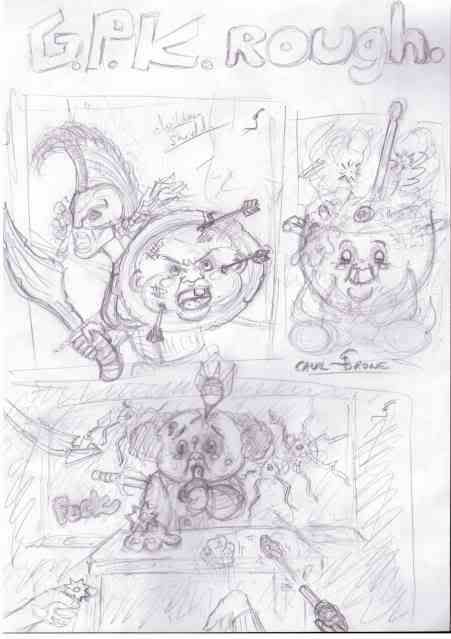 |
|
|
|
Post by rusVan on Feb 7, 2010 14:56:32 GMT -5
The "Shield" one is the most original(although ANS 7 has a similar image), definately go for that one! There is alot that can be done with the types of weapons that are stuck in the shield, the kid's expression, the placement of the strikes, etc. A arrow could even pierce through the shield for added dimension. Be careful not to over emphasize the warrior though, since the artwork is about the shield kid. Currently, the warrior's strange sword with it's oversized handle are dominating the image. Btw, is that a woman?  Can't wait to see it!! |
|
|
|
Post by rusVan on Feb 7, 2010 15:04:50 GMT -5
On second thought, the teacher concept is nice too, prehaps better. I would be cool to see you stick with one projectile. ANS produced alot of these over-crowded illustrations that simply had WAY too many ideas on one card and the images ended up busy and ultimately forgettable. More is not better in GPK, because the cards are SO tiny. Many artists are not confident enough to commit to a strong focal point so that crowd the negative space with information. For example, what if you did one about spitballs and the teacher is being sprayed by a succession of spitballs, sort of like Tommy Gun of OS 2!! ..Or paper airplanes, but that's alittle predictable. Spitballs are more punk(thus, more GPK  )! |
|
|
|
Post by greghoriblue on Feb 8, 2010 3:47:12 GMT -5
Hi RusselMania.
Thank you.
For the shield child I think I will work on the "arrow that could pierce through the shield for added dimension". It is really a great idea. And I will also work on the placement of the strike.
For the warrior, I have choosed a woman because of both themes of the drawing. I think that it is necessary that she appears. And the sword is a part of the aggressiveness which has to stand out from the drawing.
But, I am going to work again the proportions and to make a bigger shield.
For the teacher the theme is the violence at the school and the lack of means which the professors have to check this violence. I will try to paint it on a A3 paper to see if it's good or not.
See you soon on the board.
|
|