|
|
Post by kohima72 on Jan 30, 2014 6:51:39 GMT -5
Holy Crap I love these!!! Attachments:

|
|
Deleted
Deleted Member
Posts: 0
|
Post by Deleted on Jan 30, 2014 21:00:06 GMT -5
Other than Mustache Max, this is the only Junghwa Im piece I've seen in this series that I liked the artwork on. The only issue I have with it is the concept--I feel the kid should have made something gross instead of a bird (like, a trash can or toilet, or maybe a body part he was missing) to really make this a GPK.  |
|
|
|
Post by teeveesteevee on Jan 31, 2014 5:12:47 GMT -5
That is a great idea Casey. I drew up the concept for this one and now I'm thinking of things he could have folded out of paper? Junghwa Im did a good job on this one. She tweaked the colors a bit. 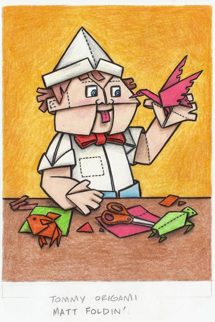 |
|
|
|
Post by billo on Jan 31, 2014 7:10:18 GMT -5
Other than Mustache Max, this is the only Junghwa Im piece I've seen in this series that I liked the artwork on... I like those as well! I really like Steve's version of origami Tommy  . |
|
|
|
Post by darnitwastaken on Jan 31, 2014 9:26:05 GMT -5
i love the picky pedro/che goo vara one  |
|
|
|
Post by Cory on Jan 31, 2014 13:02:03 GMT -5
That is a great idea Casey. I drew up the concept for this one and now I'm thinking of things he could have folded out of paper? Junghwa Im did a good job on this one. She tweaked the colors a bit. Honestly I would have rather they published this in rough from over that final. This looks so much better. Awesome concept. I love this original stuff. |
|
|
|
Post by G.Ü.N.T.H.E.R. ...........ddgr on Jan 31, 2014 13:55:22 GMT -5
Agreed. I like the little dotted lines and colors in the original. The blue face on the final throws me off a little. The feel is just a little different. Still good though.
|
|
|
|
Post by Fuzz on Jan 31, 2014 20:57:27 GMT -5
So far, my favorite is the Edward Scissorhands bonus card. It's damn near perfect.
|
|
|
|
Post by G.Ü.N.T.H.E.R. ...........ddgr on Feb 1, 2014 15:49:01 GMT -5
I like this re-hash. Looks good all-around.  |
|
|
|
Post by Cory on Feb 1, 2014 18:45:50 GMT -5
I like this re-hash. Looks good all-around. That's a straight photoshop of the original art. |
|
|
|
Post by robslob on Feb 1, 2014 18:50:56 GMT -5
[/quote]That's a straight photoshop of the original art. [/quote]  hmmm.. could be flipped and filtered. The legs seem to be in a different position though so I'm not that sure. |
|
|
|
Post by mikee2400 on Feb 1, 2014 19:43:52 GMT -5
A few pulls from my 4 Collectors Boxes I like the plates, but this one I pulled seems alot thinner than the plate I pulled in Chrome. I wonder if there is a difference in the thickness between them weird.. could just be trippin' not sure lol....  (CYAN) Also I like the Autos , but I noticed on the one I pulled it has a Puzzle back, Is it possible to make the whole 9 card puzzle if you had the 9 correct auto cards together   (normal Puzzle Back not Shown) The Art Variant card was pulled from the 4th card slot in the pack, separate from the other 2 basic BASE cards, so dont spend alot of time racking your brain looking over the stacks of base cards you have, it will be noticeable and in a "HIT" location, I.E 4th card in the pack..  (boy one her back) The C cards are also found in the 4th slot location in the pack... 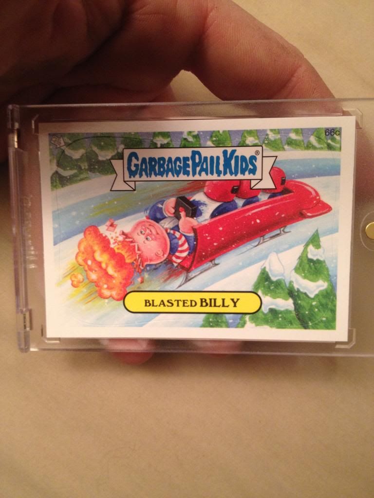  (hard to read that C its soo dark) |
|
|
|
Post by Cory on Feb 1, 2014 21:28:33 GMT -5
That's a straight photoshop of the original art. [/quote] hmmm.. could be flipped and filtered. The legs seem to be in a different position though so I'm not that sure. [/quote] Yeah, it was altered slightly but the majority is the same. It looks good. |
|
|
|
Post by billo on Feb 1, 2014 21:50:39 GMT -5
Has anyone else noticed or mentioned the "make your own name"/blank name cards would be perfect to send off to the artist for an auto  . |
|
|
|
|
|
Post by G.Ü.N.T.H.E.R. ...........ddgr on Feb 1, 2014 22:53:08 GMT -5
]That's a straight photoshop of the original art. That's what I thought at first, but there are a lot of small details that are different than the original. Perhaps it is a little too faithful of a reproduction, like holding dynamite and the knife, but I like it better than the BNS3 re-hash/mash-ups. |
|
|
|
Post by therage on Feb 1, 2014 23:26:30 GMT -5
A few pulls from my 4 Collectors Boxes I like the plates, but this one I pulled seems alot thinner than the plate I pulled in Chrome. I wonder if there is a difference in the thickness between them weird.. could just be trippin' not sure lol.... (CYAN) Also I like the Autos , but I noticed on the one I pulled it has a Puzzle back, Is it possible to make the whole 9 card puzzle if you had the 9 correct auto cards together (normal Puzzle Back not Shown) The Art Variant card was pulled from the 4th card slot in the pack, separate from the other 2 basic BASE cards, so dont spend alot of time racking your brain looking over the stacks of base cards you have, it will be noticeable and in a "HIT" location, I.E 4th card in the pack.. (boy one her back) The C cards are also found in the 4th slot location in the pack... (hard to read that C its soo dark) Really nice cards. If you ever decide to sell or trade that Blasted Billy please let me know |
|
|
|
Post by slamjim on Feb 3, 2014 11:56:36 GMT -5
I like this re-hash. Looks good all-around. That's a straight photoshop of the original art. I hand painted this completely. I was going to have him in an Olympic outfit but they did not want that. I also had much more fire, bullets and debris in my rough but that was eliminated. |
|
|
|
Post by Cory on Feb 3, 2014 11:59:51 GMT -5
That's a straight photoshop of the original art. I hand painted this completely Wow, awesome job. Amazing recreation, you fooled me. I didn't do a thorough side by side comparison, just a quick look. |
|
|
|
Post by slamjim on Feb 3, 2014 12:03:03 GMT -5
I hand painted this completely Wow, awesome job. Amazing recreation, you fooled me. I didn't do a thorough side by side comparison, just a quick look. Thanks! If you look closely you can see the leg is altered due to the skis and the camo patterns are a bit different. I tried to be as true as possible. |
|
|
|
Post by G.Ü.N.T.H.E.R. ...........ddgr on Feb 3, 2014 12:54:58 GMT -5
That's a straight photoshop of the original art. I hand painted this completely. I was going to have him in an Olympic outfit but they did not want that. I also had much more fire, bullets and debris in my rough but that was eliminated. That would have been really cool, but it still turned out well. And I was surprised to see a flying bullet in this piece. Could we get a peek at the rough drawing? |
|
|
|
Post by robslob on Feb 3, 2014 16:13:56 GMT -5
Wow, awesome job. Amazing recreation, you fooled me. I didn't do a thorough side by side comparison, just a quick look. Thanks! If you look closely you can see the leg is altered due to the skis and the camo patterns are a bit different. I tried to be as true as possible. It's very true. I noticed the leg positions as I said in my other post but other than that the similarity is amazing. Great job. |
|
|
|
Post by cMk on Feb 3, 2014 18:01:04 GMT -5
That's a straight photoshop of the original art. I hand painted this completely. I was going to have him in an Olympic outfit but they did not want that. I also had much more fire, bullets and debris in my rough but that was eliminated. Great work,all you artists do such a great job on replicating the characters. |
|
|
|
Post by Spright on Feb 11, 2014 6:53:31 GMT -5
#33 Monroe in the Closet / Bogey Manuel. Art by Junghwa. I love this card. Every time I look through my 2014 collection, I stare at this one for several minutes and smile The monster face has a late OS series feel to it.  |
|
|
|
Post by Cory on Feb 11, 2014 11:47:45 GMT -5
#33 Monroe in the Closet / Bogey Manuel. Art by Junghwa. I love this card. Every time I look through my 2014 collection, I stare at this one for several minutes and smile The monster face has a late OS series feel to it. Talk about going against the grain. Fugg.   |
|
|
|
Post by therage on Feb 11, 2014 16:41:29 GMT -5
The Monroe piece is one of my least favorites but I really like this set. So many great ones! I think my favorites are Temple Ron, Pulverized Paul, Joking Jody, Jawin Julie, Precious Preston, Kat Miss, and Adam Bomb in no particular order |
|
|
|
Post by Spright on Feb 12, 2014 6:12:25 GMT -5
You guys are entitled to your wrong opinion about the Monroe card.  < that was a joke. Seriously though, it's in my top 5 of this set. It has a certain authenticity to it- to me anyway. Ugly as hell but in the very best way. I like it because it's genuinely creepy. |
|
|
|
Post by cMk on Feb 12, 2014 13:16:05 GMT -5
You guys are entitled to your wrong opinion about the Monroe card. < that was a joke. Seriously though, it's in my top 5 of this set. It has a certain authenticity to it- to me anyway. Ugly as hell but in the very best way. I like it because it's genuinely creepy. Hopefully we'll see more creepy,monster type characters going forward.Bath Tymon and moth Manny puts off that vibe as well..Ugly stickers for the win! |
|
|
|
Post by G.Ü.N.T.H.E.R. ...........ddgr on Feb 13, 2014 0:26:34 GMT -5
You guys are entitled to your wrong opinion about the Monroe card. < that was a joke. Seriously though, it's in my top 5 of this set. It has a certain authenticity to it- to me anyway. Ugly as hell but in the very best way. I like it because it's genuinely creepy. I confess I must be sippn' on the same Sprih-dite |
|
|
|
Post by vuxnut on Feb 21, 2014 2:33:39 GMT -5
One of my personal faves of this series is  |
|


 .
.


 hmmm.. could be flipped and filtered. The legs seem to be in a different position though so I'm not that sure.


 .
. 


 < that was a joke.