|
|
Post by stoner529 on Oct 16, 2013 22:44:55 GMT -5
Speaking of checklists... The B checklist has some bold fonts where the name isnt in bold but the saying before or after the name is. Editorial FAIL.
|
|
|
|
Post by Cory on Oct 18, 2013 14:32:29 GMT -5
The hello kitty spoof gpk isn't the problem frosty. It's pretty good actually. Just felt it didn't mesh with the rest of the cards in the set because of the unblended backgroun and the dark thick countour lines on the character (yes i realize he was trying to make it cartoony but the charlie brown gpk is a better representation of what works and what doesn't, plus by staying consistent with the charlie brown gpk, it wouldn't stand out so much as a dud even with the unblended background (at first glance)). As a digital artist myself, i just find myself cringing when i see little things like that unfinished. It's so easy to fix too.... I could do that in a few minutes in photoshop using a few filters. Maybe he's not as familiar with that medium and someone else responsible for touching it up didn't have time or forgot, but it still should have been done. p.s: i didn't know it was hello kitty either till you told us. I knew it was a Hello Kitty concept but outside of the art being off as described by gpkcollector the concept isn't that good. Why can't we get something other than a lame barfing gag? It's like their idea process is.....let's spoof something......names a pop culture character....lets make it vomit lol, or put on a toilet lmao or snot it up rotflmao. I mean fugg, I'd rather have Hello Kitty just simply standing there looking like a CPK. This cat person doesn't even look like CPK in the face. It's a cat that doesn't look like a CPK or Hello Kitty puking up a hairball. That s**t isn't compelling. Rappin Ron, Jolly Roger, Roy Bot, Joe Blow and etc. are just parodies of popular people/things just turned into a CPK. Why can't they do that now? Everything has to have a dumb gag tacked on for good measure. Another example, Yeti with an ice cream cone, that I mentioned before. Ice cream adds nothing to the painting. |
|
Deleted
Deleted Member
Posts: 0
|
Post by Deleted on Oct 19, 2013 21:53:39 GMT -5
The crayola doodle sharks are not even twins anymore! are TRIPLETS FOR GODS SAKE!!! Please make it STOP! NOW Being serious the last one is not that bad but if you decide to put some color please follow the LINES!  |
|
|
|
Post by ANSestren on Oct 19, 2013 23:29:06 GMT -5
The crayola doodle sharks are not even twins anymore! are TRIPLETS FOR GODS SAKE!!! Please make it STOP! NOW Being serious the last one is not that bad but if you decide to put some color please follow the LINES! I actually like these because they are at least colored and looks like something I could've drawn.  |
|
|
|
Post by ANSestren on Oct 20, 2013 23:07:56 GMT -5
...A GOOD GPKd5g~~60_3.JPG) ...a BAD & UGLY DOODLE with a GPK Banner!  XD I absolutely like that character. Looks more like a butt mouth. |
|
|
|
Post by Nolan JP on Oct 21, 2013 1:22:48 GMT -5
Ah testicle face. A classic.
|
|
|
|
Post by recycledmichael on Oct 21, 2013 8:02:14 GMT -5
Wow that is a terrible sketch
|
|
Deleted
Deleted Member
Posts: 0
|
Post by Deleted on Oct 21, 2013 8:31:46 GMT -5
Ah testicle face. A classic. But that is the problem, is not supposed to be an "ass" face?... |
|
Deleted
Deleted Member
Posts: 0
|
Post by Deleted on Oct 21, 2013 8:33:39 GMT -5
Wow that is a terrible sketch Well is not that terrible just let's say is the 2 min rough art for a doodle!!! |
|
|
|
Post by TornShaun on Oct 21, 2013 14:04:56 GMT -5
...A GOOD GPK...a BAD & UGLY DOODLE with a GPK Banner! Them Taylor sketches are making my damn eyes bleed!!!! |
|
|
|
Post by wastinjasonbasin on Oct 25, 2013 14:30:23 GMT -5
This one looks like it was painted with butter. A decent filler concept but the art is really bad. No GPK face and looks like watercolors.  Looks like something you'd find in the sunday comics next to for better or worse! I'd say worse. |
|
|
|
Post by wastinjasonbasin on Oct 25, 2013 14:31:42 GMT -5
...A GOOD GPK...a BAD & UGLY DOODLE with a GPK Banner! Wasn't she one of the ass face family on south park? |
|
|
|
Post by wastinjasonbasin on Oct 25, 2013 14:33:04 GMT -5
This reminds me of the Troma movie Killer Condom! |
|
|
|
Post by wastinjasonbasin on Oct 25, 2013 14:36:11 GMT -5
Man oh man what the? Why Hello shitty! |
|
|
|
Post by batteredbrad on Oct 28, 2013 12:11:49 GMT -5
There were quite a few really good GPK's in BNS3 and a couple excellent ones, but here's what I'd consider to be bottom of the barrel:
Coughed Up Kitty/Hairball Mol
I enjoy the concept, but I agree with whomever stated that the background looked unfinished. The legs also look weird and the face seems to be more in line with ANS.
Alarm Clark/Snoozin' Sebastian
Again, I think the concept has promise but the execution is lacking. Why is the alarm clock soft and barely larger than the fist? Great work on the hand, however.
Lucky Luke/Numbered Nate
Terrible concept, lazy art. The hand/arm seem a bit small.
Bouncy Brody/Inflated Ian
I wish I could burn out the part of my brain that contains the memory of this GPK. It's that bad.
Worn-Out Warren/Discarded Derrick
I like the concept, but the art is lacking.
Loch Nessie/Cryptid Crissie
Lazy; boring... should have remained a myth like the "real" Loch Ness Monster.
Lost Lewis/Found Flynn
Bad art, stupid concept. The guy with the terribly-drawn arm should have just given the couch to Good Will so we wouldn't have had to see this.
Toilet Tommy/Creature Connor
Oh, look. A GPK popping out of the toilet. Haven't seen that before.
Fresh Fred/Scented Simon
I like the concept and how the GPK runs into the name bubble, but the image is a little lacking. What's the deal with his right hand, his mouth/cheeks and the fact that it says "car freshener" on it? Traditionally, it should say "GPK".
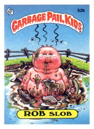
Bertha Day/Frances Frosting
Terrible. Absolutely terrible. Is it a small, terribly-drawn face or a HUGE cupcake? Why is the candle still on fire and so large? Is the terribly-drawn face spitting? Why is the terribly-drawn brain exposed? This GPK belongs in the hall of shame and should quickly be forgotten. This isn't a GPK, it's just plain garbage. If I were the head of Topps, I would issue an apology about including this in the set.
Hangman Hank/Larry Letters
Great concept poorly executed; destroyed by the decision to not make it a chalkboard image. If all letters were guessed as suggested by the letters floating in space, this GPK would have been hung 4 times over. I do like what's going on with the logo.
Dunked Darren/Don Nut
Decent concept, poorly executed (this seems to be a recurring theme in BNS3)
Party Paulie/Popped Ivan
Again.. decent concept, poorly executed. It probably would have worked better had the tongue been coming out of the party favor.
Warren' Loren/Clotheslined Caleb
Stupid concept. Next.
I'm not even going to bother with the GPK interaction cards, which should have been a subset and not part of the regular run.
|
|
|
|
Post by Edmasta on Oct 31, 2013 10:21:36 GMT -5
I want to open this thread not to attack any particular artist but after seeing so many rejected concepts, I would like to know if you were Topps Editor which BNS3 cards should have made the cut according to you, without giving any reasons if you like just imagined that you have this kind of power... To start, to me this one shouldn't  I really like this card |
|
|
|
Post by chenduz on Nov 3, 2013 8:59:19 GMT -5
Dear God... please someone take away the crayola crayons from S. Taylor's son!... this has to be THE WORST GP...sorry it does not deserve even to use that adjective...the WORST DOODLE drawn in GPK history! For the next series please someone tell THE COMPANY to put it in the hire contract for the sketch artist and the BLIND person who approve them:...It doesn't count that you only sign the cards YOU have to be sober and don't accept any assistance from your 2 year's son! and again nothing personal against the artist but COME ON!  And I'm the one who pulled this card!!  Is somebody interested?! ....  -Chenduz chenduz.deviantart.com/ |
|
|
|
Post by rastarandy on Nov 3, 2013 10:35:48 GMT -5
chenduzThe only option i see is you do a real sketch card of the same art and give the bns3 as a freebie. Keep up the great work sir.
|
|
|
|
Post by robslob on Nov 4, 2013 4:26:01 GMT -5
chenduzThe only option i see is you do a real sketch card of the same art and give the bns3 as a freebie. Keep up the great work sir. I agree. I'd pay more for a Chenduz sketch than for that doodle for sure. |
|
|
|
Post by Casper on Nov 4, 2013 6:30:57 GMT -5
I think he should do his own sketch and send it along with the original back to the artist with a note stating how to draw a gpk and maybe a pamphlet to an art school
|
|
|
|
Post by chenduz on Nov 7, 2013 13:45:07 GMT -5
Sorry Chenduz but your GARBAGE DOODLE is not even relative 1:1 and also the theory of this DOODLE was the result from a mix of tequila and crayons is not VALID anymore! ...this guy is a really GPK buyers "taste" expert! $150?!?! eBay linkySeJDBSeBW8k6R!~~60_57.JPG) LOL!! I'm selling mine for $75 then!! ....... |
|
|
|
Post by chenduz on Nov 7, 2013 13:49:06 GMT -5
I think he should do his own sketch and send it along with the original back to the artist with a note stating how to draw a gpk and maybe a pamphlet to an art school I don't want to dis any GPK artist, but I was NOT amused when I pulled this sketch card!! haha.... This is my answer:  Here you go Topps!!  -Chenduz |
|
|
|
Post by FrostyGPK on Nov 7, 2013 13:55:55 GMT -5
I think he should do his own sketch and send it along with the original back to the artist with a note stating how to draw a gpk and maybe a pamphlet to an art school I don't want to dis any GPK artist, but I was NOT amused when I pulled this sketch card!! haha.... This is my answer: Here you go Topps!! -Chenduz Dear TOPPS, Chenduz was a born to be a TOPPS artist. Don't be silly!!!! Catch this guy before its too late!!!!! Signed, Frosty |
|
|
|
Post by TRAVIS on Nov 7, 2013 14:34:54 GMT -5
Dear TOPPS, Chenduz was a born to be a TOPPS artist. Don't be silly!!!! Catch this guy before its too late!!!!! Signed, Frosty Look at that hat Topps....how can you say no? |
|
|
|
Post by Smetchlock Smomes on Nov 7, 2013 14:43:32 GMT -5
Dear TOPPS, Chenduz was a born to be a TOPPS artist. Don't be silly!!!! Catch this guy before its too late!!!!! Signed, Frosty Look at that hat Topps....how can you say no? i don't know man, looks too much like a gpk... |
|
|
|
Post by robslob on Nov 7, 2013 17:08:29 GMT -5
I think he should do his own sketch and send it along with the original back to the artist with a note stating how to draw a gpk and maybe a pamphlet to an art school I don't want to dis any GPK artist, but I was NOT amused when I pulled this sketch card!! haha.... This is my answer: Here you go Topps!! -Chenduz now THAT'S a great sketch! nice work |
|
nefud
Cabbage Patch Kid

Posts: 41
|
Post by nefud on Nov 12, 2013 15:48:59 GMT -5
Lotta people who don't understand the meaning of the word "sketch" in this thread...
|
|
Deleted
Deleted Member
Posts: 0
|
Post by Deleted on Nov 12, 2013 19:58:20 GMT -5
Lotta people who don't understand the meaning of the word "sketch" in this thread... Please enlighten us... |
|
|
|
Post by verybarrybad on Nov 12, 2013 20:19:21 GMT -5
Lotta people who don't understand the meaning of the word "sketch" in this thread... No offence... But i think you don't see the difference between a '30 seconds DOODLE' and a 'SKETCH'..... And again.....No offence.. |
|
nefud
Cabbage Patch Kid
Posts: 41
|
Post by nefud on Nov 12, 2013 20:28:14 GMT -5
It just seems like because a few artists have gone above and beyond with their sketches (sometimes even producing full color and/or finished pieces), anyone that produces something less is made fun of. It's one thing to say "I'm not very happy with this" but singling out individual artists, or calling sketches "garbage" seems a little rude/extreme to me. Then again, I'm a proud and very satisfied owner of a Pound ANS4 sketch, so what do I know?
|
|


oFIeiK,TK3BSV4u1sW6Q~~60_3.JPG)