Deleted
Deleted Member
Posts: 0
|
Post by Deleted on Oct 10, 2013 17:45:26 GMT -5
|
|
|
|
Post by bok071 on Oct 10, 2013 17:49:19 GMT -5
|
|
|
|
Post by Mr. 1985 on Oct 10, 2013 17:49:48 GMT -5
Yeah...a lot of these concepts and overal design are nice. But, they all seem to have a color-washed, low-detail look. Just seems a little strange
|
|
Deleted
Deleted Member
Posts: 0
|
Post by Deleted on Oct 10, 2013 17:52:01 GMT -5
Indeed this one is a really GOOD ONE, 3 GPKs in one shot! oWnmBSVyf0vTSg~~60_57.JPG) |
|
|
|
Post by The Doctor of Fuggonomics on Oct 10, 2013 18:13:36 GMT -5
Get it on!!!!!!
|
|
|
|
Post by Cory on Oct 10, 2013 19:02:09 GMT -5
This is so funny. The GPK face looks great but there isn't enough detail. This is an old Baked Jake fan art concept. I'll post that one for comparison purposes later. His was cool. Night with lightning, rough waves and attacking a boat. |
|
|
|
Post by ikespike on Oct 10, 2013 21:52:49 GMT -5
Interesting concepts thus far
|
|
|
|
Post by TornShaun on Oct 10, 2013 23:27:35 GMT -5
This one makes a good example what I am trying to point out with this tread: look at it  Is a lame GPK, without the name nobody could guess that is referring to the monster of Loch Ness, does it have any feature of a monster? why have to be smiling? no ears? not even a lousy texture? plain water as background?... anyway let's suppose it got screwed at the end of the process, just to blame whoever was the final artist! but how good must have been the concept to made the cut and these 2 DID NOT:  or this one:  Totally agree 100% with this one! A sub par boring card that made the cut over two awesome Gross concepts! |
|
|
|
Post by Cory on Oct 11, 2013 8:02:45 GMT -5
This is so funny. The GPK face looks great but there isn't enough detail. This is an old Baked Jake fan art concept. I'll post that one for comparison purposes later. His was cool. Night with lightning, rough waves and attacking a boat. Here is the Baked Jake Sea Serpent concept. I think if they would have done it more like this it'd be one of the best in the series. I don't hate the current BNS3 card (the art is very tight and looks GPK) but it's really really plain. Topps is going a little too far with their plain backgrounds, even the OS had a little something going on to make things interesting from time to time. 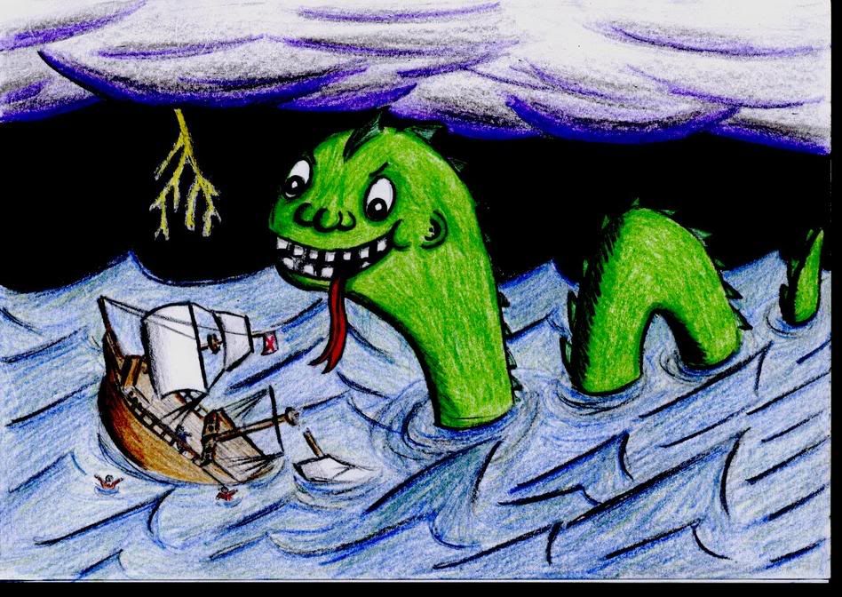 Also, just for fun, here is another Baked Jake concept that is similar to a BNS3 concept. (not saying it was stolen or etc.) This card should be in the set. It's painted perfectly and the concept is good. 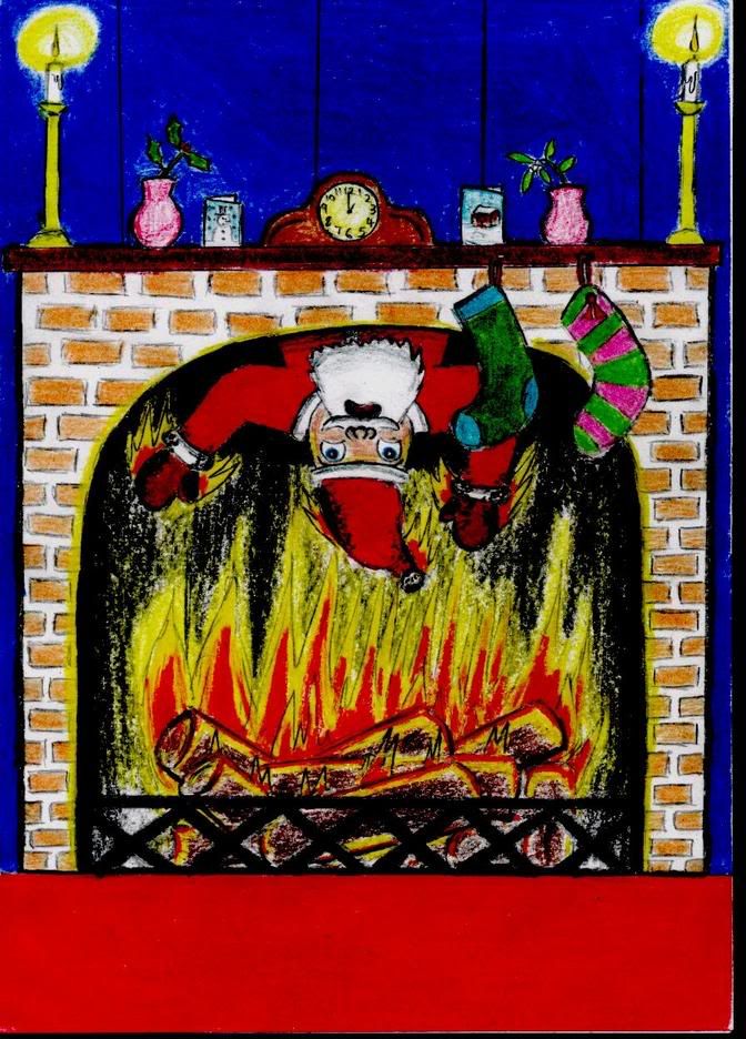 EFIoZF1YdVBSV1D5Fq!w~~60_57.JPG) |
|
|
|
Post by Cory on Oct 11, 2013 8:11:46 GMT -5
This one looks like it was painted with butter. A decent filler concept but the art is really bad. No GPK face and looks like watercolors.  |
|
|
|
Post by Cory on Oct 11, 2013 8:33:17 GMT -5
|
|
|
|
Post by Cory on Oct 11, 2013 9:30:29 GMT -5
Changed the title of this thread so I could sticky it next to THE GOOD
|
|
Deleted
Deleted Member
Posts: 0
|
Post by Deleted on Oct 11, 2013 9:40:33 GMT -5
Ok chief, excellent idea!
|
|
|
|
Post by OS Mafia on Oct 11, 2013 9:42:53 GMT -5
The hair on this is jacked up. Actually, a lot of Simko's paintings have this hair problem. The hair doesn't look like yarn and it doesn't look proportionate to the face. The faces look pretty good though. The concept is good. Examples of hair done correctly    THis is 1 thing Ive never liked with Simkos bns work. The kids hair look like that have afros. You can tell a painting he did just by that. The characters themselves look good, just not the hair |
|
|
|
Post by Cory on Oct 11, 2013 9:51:21 GMT -5
The hair on this is jacked up. Actually, a lot of Simko's paintings have this hair problem. The hair doesn't look like yarn and it doesn't look proportionate to the face. The faces look pretty good though. The concept is good. Examples of hair done correctly THis is 1 thing Ive never liked with Simkos bns work. The kids hair look like that have afros. You can tell a painting he did just by that. The characters themselves look good, just not the hair The hair is so bad that I can't even enjoy the rest of the card. It looks ridiculous almost all the time. He also messes up other things slightly but it's not as noticeable. Take a look at Adam Bomb's shoes, they just look....weird. Everything else is great...because there is no hair.  |
|
|
|
Post by OS Mafia on Oct 11, 2013 10:04:21 GMT -5
 heres the original concept from pound to compare shoes. Also the hands seem off to me as well, like mittens |
|
|
|
Post by Cory on Oct 11, 2013 10:05:52 GMT -5
This one could have been so much better because the concept isn't terrible. The GPK look is way off and the artwork is so fuggin washed out. This is Scorbions all day long....just like that peanut one. This could fit right in with ANS2 stuff like Timid Tim and Torn Tori. Also, that's either a giant cupcake or a really small human head. I think just the lips would have been enough here. The face is ugly as fugg anyway.  |
|
|
|
Post by Cory on Oct 11, 2013 10:13:06 GMT -5
This is a rare miss for Brent nowadays. This one looks like it came straight from ANS7, the series that killed GPK for years. The cheeks are mouth are very reminicent of his ANS style, which I hated. The concept is average and outdated, unless those glasses have made a comeback recently...in which case I'm outdated.   |
|
|
|
Post by Cory on Oct 11, 2013 10:15:08 GMT -5
heres the original concept from pound to compare shoes. Also the hands seem off to me as well, like mittens Nobody could do hands like Pound or Diaz. They were the masters at it. That Pound piece just shows you how far Simko still has to go. Also, I can forgive the hands because if you ever have seen a real CPK hand they do look like mittens. Fingers sewn togehter and etc. |
|
|
|
Post by OS Mafia on Oct 11, 2013 10:26:29 GMT -5
This is a rare miss for Brent nowadays. This one looks like it came straight from ANS7, the series that killed GPK for years. The cheeks are mouth are very reminicent of his ANS style, which I hated. The concept is average and outdated, unless those glasses have made a comeback recently...in which case I'm outdated. This is a kanye west parody. He made them popular again |
|
|
|
Post by TornShaun on Oct 11, 2013 10:28:14 GMT -5
This is a rare miss for Brent nowadays. This one looks like it came straight from ANS7, the series that killed GPK for years. The cheeks are mouth are very reminicent of his ANS style, which I hated. The concept is average and outdated, unless those glasses have made a comeback recently...in which case I'm outdated. ANS7 came straight into my head every time i caught a glimpse of this card! |
|
|
|
Post by TornShaun on Oct 11, 2013 10:31:38 GMT -5
This one could have been so much better because the concept isn't terrible. The GPK look is way off and the artwork is so fuggin washed out. This is Scorbions all day long....just like that peanut one. This could fit right in with ANS2 stuff like Timid Tim and Torn Tori. Also, that's either a giant cupcake or a really small human head. I think just the lips would have been enough here. The face is ugly as fugg anyway. I hate the tooth on this! It's the same with a lot on Bunks cards (not sure who painted this?) but quit with the single redneck bucktooth already lol |
|
Deleted
Deleted Member
Posts: 0
|
Post by Deleted on Oct 11, 2013 10:31:59 GMT -5
This is a rare miss for Brent nowadays. This one looks like it came straight from ANS7, the series that killed GPK for years. The cheeks are mouth are very reminicent of his ANS style, which I hated. The concept is average and outdated, unless those glasses have made a comeback recently...in which case I'm outdated. ANS7 came straight into my head every time i caught a glimpse of this card! Really? I dont know why!  |
|
|
|
Post by Cory on Oct 11, 2013 10:39:38 GMT -5
This one could have been so much better because the concept isn't terrible. The GPK look is way off and the artwork is so fuggin washed out. This is Scorbions all day long....just like that peanut one. This could fit right in with ANS2 stuff like Timid Tim and Torn Tori. Also, that's either a giant cupcake or a really small human head. I think just the lips would have been enough here. The face is ugly as fugg anyway. I hate the tooth on this! It's the same with a lot on Bunks cards (not sure who painted this?) but quit with the single redneck bucktooth already lol Haahahah. There is a lot more to dislike than just the tooth, but I hear you on the single tooth over use. |
|
Deleted
Deleted Member
Posts: 0
|
Post by Deleted on Oct 11, 2013 10:41:25 GMT -5
Another "Sgorbions" type of card...  |
|
Deleted
Deleted Member
Posts: 0
|
Post by Deleted on Oct 11, 2013 10:43:23 GMT -5
Could any one establish a relation/link between the lug and the baby's body?  |
|
simonbelmont7
Cabbage Patch Kid
 Jonesing for the latest GPK. Darn you, Dave and Adam's! Darn you to heck!
Posts: 22 
|
Post by simonbelmont7 on Oct 11, 2013 10:44:03 GMT -5
Is someone in the art department monitoring how closely these things look to original CPK's or something? It's like they are stepping carefully around the rules. The Loch Nessie has an almost perfect head and face but the background is bland. Could they have certain rules in regards to litigation? (i.e. Face can look like CPK but background can't resemble anything from past GPK cards?) Sounds stupid but the thought crossed my mind anyway.
|
|
|
|
Post by Cory on Oct 11, 2013 10:53:27 GMT -5
Could any one establish a relation/link between the lug and the baby's body? Usually the gag would be the person is sawing a log in their dream. I think sawing the log thing came from people snoring. They made the log literal but the concept still isn't that compelling. The art is pretty good though. |
|
Deleted
Deleted Member
Posts: 0
|
Post by Deleted on Oct 11, 2013 10:55:13 GMT -5
Talking about shoes and mittens, Cats are supposed to have paws, right? oFIeiK,TK3BSV4u1sW6Q~~60_3.JPG) |
|
|
|
Post by Cory on Oct 11, 2013 11:00:02 GMT -5
Talking about shoes and mittens, Cats are supposed to have paws, right? Terrible card. I hate everything about it. Looks like a GPK in a Furry costume. Lame as fugg gag too. |
|