|
|
Post by Cory on Mar 5, 2014 10:03:07 GMT -5
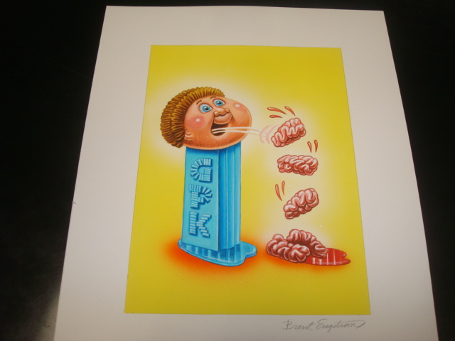
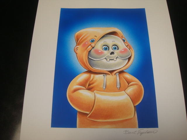
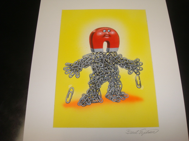
Going with a bright green frame for hulk. Dark Blue for Hoodie. Not sure yet on Pez, yellow or sky blue. Possibly red for Magnet Mick, the yellow is pretty dark not sure if I could get a decent match. Really looking forward to seeing them framed up, especially the Hulk piece. At times, I hate being constricted by only using black frames; I'd assume you run into the same issue only using black mats. There are some amazing color combos waiting to be put together with these last 4 for sure! I don't feel constricted at all. I chose black mats because I wanted the art to speak for itself. I wanted it to pop out of the frame as the real reason we are looking to begin with. I think mat colors draw too much attention away from the art...especially double mats. Less is more is a lesson I've learned over the years. |
|
|
|
Post by Oliver on Mar 5, 2014 10:47:33 GMT -5
Really looking forward to seeing them framed up, especially the Hulk piece. At times, I hate being constricted by only using black frames; I'd assume you run into the same issue only using black mats. There are some amazing color combos waiting to be put together with these last 4 for sure! I don't feel constricted at all. I chose black mats because I wanted the art to speak for itself. I wanted it to pop out of the frame as the real reason we are looking to begin with. I think mat colors draw too much attention away from the art...especially double mats. Less is more is a lesson I've learned over the years. I've always thought the different colored mats and frames highlight the incredible colors and sometimes bring out the more subtle features of these works personally. I do enjoy the uniformity of all black frames and mats though because like you said it lets the art stand for itself and it also brings a sense of professionalism I think. It's been a real privlage to have been able to come to the UG and see so many different takes regarding framing from so many different collectors. |
|
|
|
Post by Cory on Mar 5, 2014 20:16:24 GMT -5
|
|
Deleted
Deleted Member
Posts: 0
|
Post by Deleted on Mar 7, 2014 14:04:14 GMT -5
Those pics I took in the yellow light were not working for me so I had to retake them.  Breath taking!! So awesome dude! |
|
|
|
Post by Cory on May 15, 2014 21:18:24 GMT -5
OS9 upgrade time.  Doesn't this piece just look epic without the banner and name bar? I'm in love with the colors on this piece. This card never really printed that well in the series. It was always super dark. This is top 2 of OS9 for me. So many great cards in OS9 that it's tough go really lock in on a piece as a favorite. I have a feeling I'll be keeping this one for a long long time. 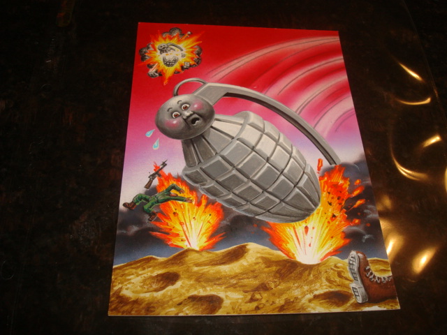 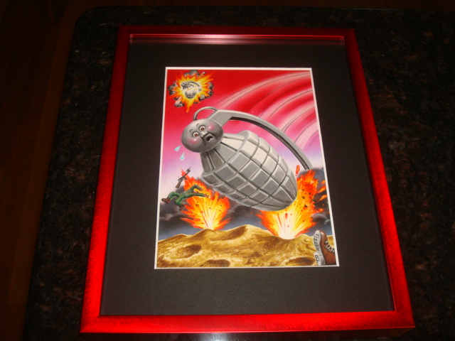 Framed |
|
|
|
Post by Dirty dog on May 15, 2014 21:28:20 GMT -5
|
|
|
|
Post by Steve on May 15, 2014 21:54:07 GMT -5
Friggin sweet OS9 final! I wonder why some of the OS cards seem to lose color quality when printed and others don't? Geoff's OS12 Heavy Meryl is another example of color quality lost during printing. BTW, I would keep Clark if I were you, one of the best of an already outstanding series. But if you do let him go I will surely take him off your hands  |
|
|
|
Post by rusVan on May 15, 2014 22:51:32 GMT -5
OS9 upgrade time. Doesn't this piece just look epic without the banner and name bar? I'm in love with the colors on this piece. This card never really printed that well in the series. It was always super dark. This is top 2 of OS9 for me. So many great cards in OS9 that it's tough go really lock in on a piece as a favorite. I have a feeling I'll be keeping this one for a long long time. I haven't decided what I'm doing with Clark Shark yet. It a tough piece to let go of and it's a flashback 2 final. Decisions, decisions.  I bet you are a proud new papa!  Killer graphic work on this GPK!  Let me or Jimbo know if you want APOON GOON inked at the top! |
|
|
|
Post by G.Ü.N.T.H.E.R. ...........ddgr on May 15, 2014 23:36:01 GMT -5
I didn't realized there's another GPK grenade in the background. Sweet piece. OS 9 is a great series.
|
|
|
|
Post by Keirmon on May 16, 2014 4:17:04 GMT -5
Love the final, so much better than the card!
|
|
|
|
Post by Oliver on May 16, 2014 6:16:35 GMT -5
Agreed - OS9 is really tough because soooo many are great but this is right at the top! Amazing final!!!
|
|
|
|
Post by Cory on May 16, 2014 6:31:36 GMT -5
I didn't realized there's another GPK grenade in the background. Sweet piece. OS 9 is a great series. The grenade in the background was one of my favorite details back when I was a kid. I loved when extra stuff was in the backgrounds. |
|
|
|
Post by iamweasel on May 16, 2014 6:48:29 GMT -5
I didn't realized there's another GPK grenade in the background. Sweet piece. OS 9 is a great series. The grenade in the background was one of my favorite details back when I was a kid. I loved when extra stuff was in the backgrounds. Me too. I loved looking at the cards over & over again finding new little things each time. These last few series have been so plain or non existant with their backgrounds. The first time youve seen the card there is nothing left to discover because the background is too simplistic. |
|
|
|
Post by Jimbo on May 16, 2014 6:55:35 GMT -5
OS9 upgrade time. Doesn't this piece just look epic without the banner and name bar? I'm in love with the colors on this piece. This card never really printed that well in the series. It was always super dark. This is top 2 of OS9 for me. So many great cards in OS9 that it's tough go really lock in on a piece as a favorite. I have a feeling I'll be keeping this one for a long long time. I haven't decided what I'm doing with Clark Shark yet. It a tough piece to let go of and it's a flashback 2 final. Decisions, decisions. Awesome piece! The grenade's face is perfect. I also love the boot on the right. You know there is a body laying there. |
|
|
|
Post by Cory on May 16, 2014 8:19:13 GMT -5
The grenade in the background was one of my favorite details back when I was a kid. I loved when extra stuff was in the backgrounds. Me too. I loved looking at the cards over & over again finding new little things each time. These last few series have been so plain or non existant with their backgrounds. The first time youve seen the card there is nothing left to discover because the background is too simplistic. Dyna Mike is probably my favorite GPK simply because so much is going on. There is so much to look at and yet it's still a perfect CPK look. I agree with you about backgrounds today being way too simplistic. I like a simple background where they make sense but sometimes you need a ilttle something extra to sell the "story". My favorite thing about the ANS was the detailed backgrounds. |
|
|
|
Post by Cory on May 16, 2014 8:20:13 GMT -5
OS9 upgrade time. Doesn't this piece just look epic without the banner and name bar? I'm in love with the colors on this piece. This card never really printed that well in the series. It was always super dark. This is top 2 of OS9 for me. So many great cards in OS9 that it's tough go really lock in on a piece as a favorite. I have a feeling I'll be keeping this one for a long long time. I haven't decided what I'm doing with Clark Shark yet. It a tough piece to let go of and it's a flashback 2 final. Decisions, decisions. Awesome piece! The grenade's face is perfect. I also love the boot on the right. You know there is a body laying there. Or not. Could be just a severed leg there. |
|
|
|
Post by OS Mafia on May 16, 2014 8:53:55 GMT -5
Wow what a difference from the card version. Its always nice to get a piece in your hands that you loved as a kid.
Congrats Cory!
BTW what is the #1 final? Semi Colin? Scalped Ralph? My top 3 are swiss Kris, trap Dora and a 3 way tie between skin less/Clark shark and minus Hans
|
|
|
|
Post by Cory on May 16, 2014 14:12:37 GMT -5
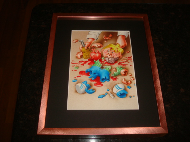
Wow what a difference from the card version. Its always nice to get a piece in your hands that you loved as a kid. Congrats Cory! BTW what is the #1 final? Semi Colin? Scalped Ralph? My top 3 are swiss Kris, trap Dora and a 3 way tie between skin less/Clark shark and minus Hans Scalped Ralph is my #1. Then: Hannah Grenade Trap Dora Sizzlin' Sid Semi Colin Clark Shark |
|
|
|
Post by Steve on May 16, 2014 15:13:19 GMT -5
If you still had Cherry Bomb, you coulda hung it with Dyna Mike and Hannah Grenade for an explosion themed GPK wall  |
|
|
|
Post by JAY .U.K on May 16, 2014 17:10:29 GMT -5
Amazing collection Cory I am speachless  |
|
|
|
Post by Cory on May 16, 2014 19:34:58 GMT -5
If you still had Cherry Bomb, you coulda hung it with Dyna Mike and Hannah Grenade for an explosion themed GPK wall Irate Ira, Adam Bomb Family, Troy Destroy and Blown-up Bruce will have to join Dyna Mike keep the explosion theme Hanna Grenade company. |
|
|
|
Post by Steve on May 16, 2014 20:12:11 GMT -5
If you still had Cherry Bomb, you coulda hung it with Dyna Mike and Hannah Grenade for an explosion themed GPK wall Irate Ira, Adam Bomb Family, Troy Destroy and Blown-up Bruce will have to join Dyna Mike keep the explosion theme Hanna Grenade company. I bet all those on the wall under a black light would look bad ass.  |
|
|
|
Post by Cory on May 18, 2014 13:18:08 GMT -5
|
|
|
|
Post by JAY .U.K on May 18, 2014 13:27:07 GMT -5
Looking awesome Cory ;)the OS9 looks bad ass in the red.
|
|
|
|
Post by Jimbo on May 18, 2014 14:58:53 GMT -5
Looks great Cory!
|
|
|
|
Post by Oliver on May 18, 2014 17:32:45 GMT -5
Right on - that red is perfect on Hanna!
|
|
|
|
Post by cMk on May 18, 2014 19:52:31 GMT -5
The os14 looks great with the peach frame.Very colorful pieces!
|
|
|
|
Post by Steve on May 18, 2014 22:33:20 GMT -5
Damn, the OS 9 looks great! Are we going to see the money shot of your full run with the new additions?
|
|
|
|
Post by Game8 on May 19, 2014 4:43:37 GMT -5
Just wow cory. Your art collection is amazing!
|
|
|
|
Post by Cory on May 19, 2014 18:00:54 GMT -5
Damn, the OS 9 looks great! Are we going to see the money shot of your full run with the new additions? None of them are on the wall now because I moved and need to remodel my game room. I'm hoping to do that in the next few months. |
|


 Doesn't this piece just look epic without the banner and name bar? I'm in love with the colors on this piece. This card never really printed that well in the series. It was always super dark.


 Killer graphic work on this GPK!


 They look incredible in person though.