Deleted
Deleted Member
Posts: 0
|
Post by Deleted on Feb 19, 2014 0:35:33 GMT -5
Wow, so cool to see these his res pics. I've seen your vids on YouTube, but one can appreciate those original arts better here. Amazing!!
|
|
|
|
Post by TornShaun on Feb 19, 2014 0:42:05 GMT -5
Had this one saved with Mark since September of last year but he couldnt sell till the set released. The colors are bright and the painting is super detailed ENJOY    Great addition to your collection |
|
|
|
Post by OS Mafia on Apr 9, 2014 22:38:22 GMT -5
I cant believe I havent posted anything new in almost 2 months. Big thanks to Steve for letting these go. First is a series 14 Pound Ive had for about a month or 2 now. Really excited to have this one in my collection This one just oozes how gross the cards were back then.   Next up is an os7 final from James Warhola. The detail is so cool on this one in person and the green is SUPER bright. I love the sweat droplets on his face. This final gets me closer to one from each series. I doubt ill ever own anything from series 1 or 2 but for now I have series 6-15   |
|
|
|
Post by Steve on Apr 10, 2014 6:22:00 GMT -5
Glad they have a great new home with a passionate collector who will appreciate their beauty! Can't wait to see those authentic true 1/1 pieces of original artwork all framed up!
|
|
|
|
Post by Oliver on Apr 10, 2014 7:44:53 GMT -5
Nothing beats Original Art! Hedda is a awesome final - Such vibrant colors and depth... I love the extreme color differences stacked from hairbow to table; great piece! Really cool seeing these previously unknown details (to me at least) on Jim as well. The green (oil I believe) still almost looks wet!  Congratulations on making it so far; OS6-15 is HUGE! |
|
|
|
Post by OS Mafia on Apr 10, 2014 8:36:49 GMT -5
Glad they have a great new home with a passionate collector who will appreciate their beauty! Can't wait to see those authentic true 1/1 pieces of original artwork all framed up! Anything os11 and 14 instantly brings me back every time. I didn't get any series 7 cards until I was about 12 years old but I remember Jim nauseum fondly. |
|
|
|
Post by OS Mafia on Apr 10, 2014 8:40:01 GMT -5
Nothing beats Original Art! Hedda is a awesome final - Such vibrant colors and depth... I love the extreme color differences stacked from hairbow to table; great piece! Really cool seeing these previously unknown details (to me at least) on Jim as well. The green (oil I believe) still almost looks wet! Congratulations on making it so far; OS6-15 is HUGE! I believe he used tempara paint or so I've been told. Which is an earlier form of oil painting. That's one of the things I wish warhola did was use acrylic. Anyone who owns a pound painting can see how the gpk almost pops off the board since the background is a little duller. You can tell warhola painted and blended all of his backrounds. |
|
|
|
Post by billo on Apr 10, 2014 8:55:16 GMT -5
Great additions Geoff! Jim is super nice. I love the green to black backround, and want to see your matte choices for these  . |
|
|
|
Post by OS Mafia on Apr 10, 2014 9:05:57 GMT -5
Great additions Geoff! Jim is super nice. I love the green to black backround, and want to see your matte choices for these . This one is gonna be hard since the only colors on the painting are purple yellow and green. Might have to do yellow and green or yellow and black. Any suggestions? |
|
|
|
Post by Oliver on Apr 10, 2014 10:03:28 GMT -5
Our suggestion for Jim would be for the frame using the closest color you could find to the middle blended color of the green and black background. Something pulled from the top middle of the background colors would look nice and that's what we used as the inner mat color on our Monte Zuma color rough and we really enjoyed that. We would then probably suggest using the yellow from his shirt as the larger mat and the Blue from his shorts as the inner mat. There are quite a few combinations you could do with this piece but this is just one thought. Man, we really love framing. We're ready to buy another piece now just to have something else to frame lol!!!
|
|
|
|
Post by Steve on Apr 10, 2014 10:56:40 GMT -5
I've always like the green/black background color on Jim Nauseum and with the addition of a killer matte combo that piece is going to pop! I look forward to seeing whatever you decide to go with Geoff.
|
|
|
|
Post by billo on Apr 10, 2014 11:39:03 GMT -5
This one is gonna be hard since the only colors on the painting are purple yellow and green. Might have to do yellow and green or yellow and black. Any suggestions? Great suggestions so far! There is a little red in the socks and the flesh rips... Maybe a thin inner red matte, green outter and and black frame. ...Man, we really love framing. We're ready to buy another piece now just to have something else to frame lol!!! No need to purchase more, you and your wife are welcome to frame my naked pieces (which is why they aren't in my collection thread!).
|
|
|
|
Post by Oliver on Apr 10, 2014 11:48:08 GMT -5
This one is gonna be hard since the only colors on the painting are purple yellow and green. Might have to do yellow and green or yellow and black. Any suggestions? Great suggestions so far! There is a little red in the socks and the flesh rips... Maybe a thin inner red matte, green outter and and black frame. ...Man, we really love framing. We're ready to buy another piece now just to have something else to frame lol!!! No need to purchase more, you and your wife are welcome to frame my naked pieces (which is why they aren't in my collection thread!).
Great framing idea Bill! A nice "loud to mute" concept would be awesome with this piece! Prominent colors like the red really help pop and showcase artwork. We would also suggest consider using the bronze color from the rings; a really nice contrast would happen either way. We'd also be happy to help with your framing's Bill but the problem is you see, once we become so invested emotionally in A piece such as through the process of framing it, I'm not sure we'd have the heart to send it back to you  !!! |
|
|
|
Post by Cory on Apr 10, 2014 16:33:27 GMT -5
Congrats on the OS6-15. That's quite an accomplishment. |
|
|
|
Post by Jimbo on Apr 10, 2014 16:53:25 GMT -5
Nice stuff Geoff. Keep them coming.
|
|
|
|
Post by Edmasta on Apr 10, 2014 17:01:20 GMT -5
Great stuff man!
|
|
|
|
Post by cMk on Apr 10, 2014 17:55:38 GMT -5
Great additions Geoff! Jim is super nice. I love the green to black backround, and want to see your matte choices for these . This one is gonna be hard since the only colors on the painting are purple yellow and green. Might have to do yellow and green or yellow and black. Any suggestions? I'm thinking a bright white double mat or inside mat that matches his shorts with a wooden frame to match the color of the rings. |
|
|
|
Post by OS Mafia on Apr 10, 2014 21:02:47 GMT -5
Congrats on the OS6-15. That's quite an accomplishment. Thanks Cory. Its getting harder and harder as the years go by. Especially if you want a pound from every series. 8 of 10 are pounds for me though. |
|
|
|
Post by OS Mafia on Apr 10, 2014 21:14:30 GMT -5
Nice stuff Geoff. Keep them coming. Thanks Adam. I have a few more pieces in mind I'll be picking up in the future. |
|
|
|
Post by OS Mafia on Apr 10, 2014 21:17:09 GMT -5
Great suggestions so far! There is a little red in the socks and the flesh rips... Maybe a thin inner red matte, green outter and and black frame. No need to purchase more, you and your wife are welcome to frame my naked pieces (which is why they aren't in my collection thread!).
Great framing idea Bill! A nice "loud to mute" concept would be awesome with this piece! Prominent colors like the red really help pop and showcase artwork. We would also suggest consider using the bronze color from the rings; a really nice contrast would happen either way. We'd also be happy to help with your framing's Bill but the problem is you see, once we become so invested emotionally in A piece such as through the process of framing it, I'm not sure we'd have the heart to send it back to you !!! I was thinking of possibly doing a bronze frame or bronze small matte like I used for bitten Brian. Its always easier to make a desision when I'm at the art place and the mattes in front of me. |
|
|
|
Post by OS Mafia on Apr 10, 2014 21:18:13 GMT -5
This one is gonna be hard since the only colors on the painting are purple yellow and green. Might have to do yellow and green or yellow and black. Any suggestions? I'm thinking a bright white double mat or inside mat that matches his shorts with a wooden frame to match the color of the rings. A wooden frame would be cool but all of my others are metal frames. |
|
|
|
Post by OS Mafia on Apr 24, 2014 21:46:24 GMT -5
A recent pickup Series 12 Pound Heavy Meryl/One Night Stan The card makes the red color look really dull but its so vibrant in person!   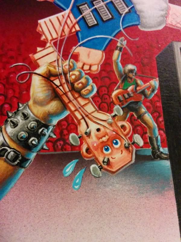 |
|
|
|
Post by Dirty dog on Apr 24, 2014 22:42:35 GMT -5
One of the best OS12's. Nothing dull looking at all. Congrats! |
|
|
|
Post by OS Mafia on Apr 24, 2014 22:51:59 GMT -5
One of the best OS12's. Nothing dull looking at all. Congrats! Thanks Tony ive always liked this gpk. I know the color rough for it is on eBay but its owned by Clint. |
|
|
|
Post by pepé on Apr 25, 2014 3:19:51 GMT -5
A recent pickup Series 12 Pound Heavy Meryl/One Night Stan The card makes the red color look really dull but its so vibrant in person! Awesome pickup ! |
|
|
|
Post by OS Mafia on Apr 25, 2014 23:05:42 GMT -5
A recent pickup Series 12 Pound Heavy Meryl/One Night Stan The card makes the red color look really dull but its so vibrant in person! Awesome pickup ! Thanks for the compliment. One of my favorite os12 finals. |
|
|
|
Post by Oliver on Apr 26, 2014 9:38:24 GMT -5
Congrats Geoff, Meryl is a really cool piece! This has to be the final with the most drastic color difference vs the printed card that I've personally ever seen. Great pick up!
|
|
|
|
Post by Smetchlock Smomes on Apr 26, 2014 12:13:44 GMT -5
Some OS12 love for pound. It's too bad so many of those characters have been forgotten about. Nice pickup mafia. Looking forward to the final frame up.
|
|
|
|
Post by OS Mafia on May 3, 2014 20:05:00 GMT -5
Nothing crazy as far as updates. I did send my os12 heavy meryl and os14 off to the framers Also changed the matte color with something I had laying around  |
|
|
|
Post by Steve on May 3, 2014 20:18:03 GMT -5
Nothing crazy as far as updates. I did send my os12 heavy meryl and os14 off to the framers Also changed the matte color with something I had laying around Nice color combo Geoff, looking forward to seeing all your artwork on the new wall! |
|


 Congratulations on making it so far; OS6-15 is HUGE!

 .
. !!!
!!!