|
|
Post by Cory on Jan 11, 2007 12:42:03 GMT -5
 I got this from Aaron's site. Most of you probably haven't seen it yet. Here is what he says: "The Original final Artwork Piece completed by John Pound for cards 248a "HECTOR Collector" and 248b "G.P. KAY" is owned by Mark Newgarden, the art director for the sixteen original GPK series' in the 80's. The piece was completed before the 6th series release, but was later redone by artist James Warhola. Unlike the piece done by Warhola (with 9 sticker images), there are no distinguishable GPK images from previous series' that can be found on Pound's "Kid" (with 16 stickers), but there are twice as many stickers and a floor area." Here is the Warhola version again: 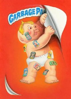 I still think the banana peel makes no f**cking sense. :lol1: |
|
Deleted
Deleted Member
Posts: 0
|
Post by Deleted on Jan 11, 2007 17:20:35 GMT -5
Pretty cool…Cory!!!
My opinion is that Topps is playing on words: banana peel = Peeling the sticker
-D
|
|
|
|
Post by Sniglet on Jan 11, 2007 22:28:28 GMT -5
I think those both are done pretty well. I prefer the Warhola version of the GPK actually on the card minus the floor. It would've been cool to see which cards Pound would choose if he actually made those stickers real GPK
|
|
|
|
Post by spree on Jan 11, 2007 23:56:40 GMT -5
that's pretty cool. Yea, the banana peel is dumb.
|
|
|
|
Post by Stinger on Jan 12, 2007 1:24:29 GMT -5
I don't recall seeing this before. I prefer James Warhola's version. Pounds' has way too many stickers and I dislike the floor.
|
|
|
|
Post by Mr. Nice Vero! on Feb 16, 2008 8:30:37 GMT -5
im voting for pound on this one...
and yes ...I know this is not a poll !
|
|
|
|
Post by TornShaun on Feb 16, 2008 8:38:18 GMT -5
The Pound ones is better imo  |
|
|
|
Post by gpknation2010 on Mar 3, 2008 16:35:27 GMT -5
I dont like how the pound one has a floor! And the bannana peal is strange!
|
|
|
|
Post by GPK Monster on Mar 14, 2008 8:37:19 GMT -5
I bet it was meant to have the arrow "peel here" pointing at it. What a bunch of goobs at Topps
|
|
|
|
Post by CAPLOX on Sept 7, 2008 23:17:13 GMT -5
I PREFER THE POUND ONE. WISH I COULD FIND ONE OF SKETCHES/ART WORK PIECES FOR FORMELADE HEIDI
|
|
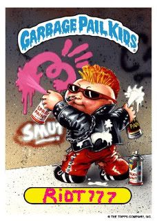
riot777
Cabbage Patch Kid

Posts: 19
|
Post by riot777 on Jul 7, 2009 11:30:13 GMT -5
Im going with the Warhola version!  |
|
|
|
Post by BarrenAARON on Jul 7, 2009 12:53:20 GMT -5
WTF? Ripping off material from my site... dagnabit... heh. How DARE thee Cory... Hiya!
I'm a historical buff, for GPK, so I get my rocks off when shite like this surfaces; and it must be upstairs at Newgarden's because it wasn't in his art studio that I recall. At any rate, if memory serves me right, overall, the art department wasn't too happy with the looking-over-the-shoulder stance of Pound's original piece, and like previous series' and introducing new artists to GPK, re-done Pound art was often completed by newcomers. If anyone hasn't read over the Pound interview on my site, I'd look it over, if nothing else for the pictures of other occurances like this (the material I end up squeezing into the "GPK History" sections of the mentioned series' too). It sheds some light on art direction if nothing else.
The frontal stance of Warhola's image fills the picture better on-the-whole, and I like the addition of the extra partial 'peel' at the bottom of the picture, thus relieving the necessity of a 'floor'... however, I do like the 'floor' in Pound's work and I like the additional stickers... I think it makes the name "HECTOR Collector" that much more powerful/poignant, like he's completely covered in his obsession -- *mental note to be buried this way, minus the panana peel... and diaper* -- without the floor and extra stickers, Warhola's image almost has a lighter feel compared to Pound's piece; too much 'free space' on the 'canvas' per se... if that makes sense.
Lastly, I dig the GPK header actually painted onto the artwork (because of shading, etcetera), this doesn't happen all that often.
|
|
|
|
Post by Cory on Jul 7, 2009 12:56:06 GMT -5
WTF? Ripping off material from my site... dagnabit... heh. How DARE thee Cory... Hiya! I'm a historical buff, for GPK, so I get my rocks off when shite like this surfaces; and it must be upstairs at Newgarden's because it wasn't in his art studio that I recall. At any rate, if memory serves me right, overall, the art department wasn't too happy with the looking-over-the-shoulder stance of Pound's original piece, and like previous series' and introducing new artists to GPK, re-done Pound art was often completed by newcomers. If anyone hasn't read over the Pound interview on my site, I'd look it over, if nothing else for the pictures of other occurances like this (the material I end up squeezing into the "GPK History" sections of the mentioned series' too). It sheds some light on art direction if nothing else. The frontal stance of Warhola's image fills the picture better on-the-whole, and I like the addition of the extra partial 'peel' at the bottom of the picture, thus relieving the necessity of a 'floor'... however, I do like the 'floor' in Pound's work and I like the additional stickers... I think it makes the name "HECTOR Collector" that much more powerful/poignant, like he's completely covered in his obsession -- *mental note to be buried this way, minus the panana peel... and diaper* -- without the floor and extra stickers, Warhola's image almost has a lighter feel compared to Pound's piece; too much 'free space' on the 'canvas' per se... if that makes sense. Lastly, I dig the GPK header actually painted onto the artwork (because of shading, etcetera), this doesn't happen all that often. Affiliates FTW!  Do up a will so that at your funeral every attendee has to peel and stick a GPK to your corpse. That would be fuggin epic! |
|
|
|
Post by BarrenAARON on Jul 7, 2009 13:31:55 GMT -5
Fuggin' hilarious... you know that party would be a no-show. "Please grab a sticker and an anti-bacterial wipe...". I'd start with the 2nd series. You know you'd pocket "Schizo FRAN".
|
|
|
|
Post by Cory on Jul 7, 2009 14:42:23 GMT -5
Fuggin' hilarious... you know that party would be a no-show. "Please grab a sticker and an anti-bacterial wipe...". I'd start with the 2nd series. You know you'd pocket "Schizo FRAN". I'd show up if I was still alive.  |
|
|
|
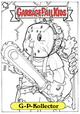
Post by G-P-Kollector on Jul 11, 2009 0:34:00 GMT -5
I'd represent that casket brother..... I personally like the Pound piece... But this is DEFINATELY one of my favorite cards regardless.......Go figure..... |
|
|
|
Post by G-P-Kollector on Jul 11, 2009 0:40:06 GMT -5
there are no distinguishable GPK images from previous series' that can be found on Pound's "Kid" (with 16 stickers), but there are twice as many stickers and a floor area." "No 'Distinguishable GPK images from other series'  ?" I can prolly name AT LEAST 4 of the stickers depicted in Pound's original...... am I alone there?  Maybe this could be a "Bonus question" worth a point a pop in the next UG contest..... |
|
|
|
Post by Mike on Jul 11, 2009 21:25:04 GMT -5
there are no distinguishable GPK images from previous series' that can be found on Pound's "Kid" (with 16 stickers), but there are twice as many stickers and a floor area." "No 'Distinguishable GPK images from other series' ?" I can prolly name AT LEAST 4 of the stickers depicted in Pound's original...... am I alone there? Maybe this could be a "Bonus question" worth a point a pop in the next UG contest..... I was thinking the same thing, I can make out a bunch of 'em |
|
|
|
Post by GRANT_ant on Nov 1, 2009 1:53:01 GMT -5
Yeah I know this is an old topic but I really like it......I was also thinking the same thing that gpkollector and Mike were thinking - just by looking at pound's version briefly I can see what resembles a "meltin' melissa", a possible "patty putty" or "april showers", unstitched mitch, cranky frankie and dana druff....but I could be wrong. What does anyone else see just out of curriousity? I like the pound version of this gpk only because his version looks more like an actual cabbage patch kid - if you compare the eyes from Pound's version to Warhola's you can clearly notice this - also the dimple on the elbow on pound's version makes it look more like a cpk - which is what I personally always prefered - gpk to resemble cpk a.k.a. Pound's versions from os 1-9........Ii have always hated that f**king bannana peel. Everytime that I look at this card It looks like a gpk with blonde hair at first. But I do like how Warhola's version actually looks like a sticker coming off the card with both top and bottom corners peeling away - thats my 2 cents anyway.
|
|
|
|
Post by BarrenAARON on Nov 12, 2009 22:42:48 GMT -5
Ummm... I unfortunately cannot go by "resembles" or "possibly" before I publish something on the site, so I took the safe route and put "indistinguishable"; nothing truly stands out like they do on Warhola's piece; I'm not into guessing when reporting GPK "news". Is G-P-Kollector or Mike going to actually list what they so easily see??? I'll try going to the source and asking Pound if he can recall his thoughts on the piece at the time... =/
|
|
|
|
Post by Cory on Nov 13, 2009 3:16:59 GMT -5
Ummm... I unfortunately cannot go by "resembles" or "possibly" before I publish something on the site, so I took the safe route and put "indistinguishable"; nothing truly stands out like they do on Warhola's piece; I'm not into guessing when reporting GPK "news". Is G-P-Kollector or Mike going to actually list what they so easily see??? I'll try going to the source and asking Pound if he can recall his thoughts on the piece at the time... =/ There's really nothing on the painting that is exact. There are some that kind of have similar colors as some real GPK but there isn't enough detail to say for sure. About the only one on there that really looks like something (outside of just colors) is the one on his face that looks like Jules Drools. Although the whole thing is blue and Jules has gray as half of the background. |
|
|
|
Post by AndrewGPK on Sept 17, 2010 15:32:26 GMT -5
I bet it was meant to have the arrow "peel here" pointing at it. What a bunch of goobs at Topps That would have been cool, but difficult to pull off unless his head actually covered the GPK sign. I think that as the card is emblematic and representative of the GPK series itself, that Pound was likely using the peel to reference back to the original GPK - that is, the Wacky Packages card he painted for topps that the series is based on. If you notice, the GPK coming out of the trashcan in that original drawing had a bannana peel on his head. -------------- As for the card itself, I prefer the Pound character design and art, but I like the revised background better. The floor should go IMO and I like the way the revised drawing peels up in the bottom corner. Attachments:
|
|
|
|
Post by Juice on Mar 23, 2011 21:01:56 GMT -5
No 'Distinguishable GPK images from other series' ? Attachments:
|
|
Greaser Greg
Junior GPK
G.P.K. Movie Star
Wanna rumble!
Posts: 239
|
Post by Greaser Greg on Jul 5, 2011 20:00:38 GMT -5
The bannna peel on his head is because he likes to peel stuff simple
|
|